
A visual language for an invisible product, BUX, 2022
Project scope
Visual language, brand devices, iconography system. Role as Concept lead and Designer.
Scenario
BUX is Europe's fastest growing neobroker, making it easy and affordable for Europeans to do more with their money since 2014. But a broker is, by definition, an abstraction - a person or company who buys and sells goods or assets for others. And its products are abstractions too. A stock, an ETF, a fractional share, a savings plan: there is nothing there to photograph. Most brokers solve this by not solving it. Stock photography, generic upward charts, an icon set borrowed from every other fintech. The category all looks the same because the category is all describing the same invisible thing. Meanwhile, the actual differentiator sat in the offer. Not only the assets a regular broker provides - stocks, ETFs, crypto - but pioneering products such as fractional shares, fractional ETFs and savings plans. That range had a structure: fractionals derive from stocks and ETFs, a savings plan combines all of it. It was the clearest argument BUX had, and the brand had no way of showing it. The problem was never a missing illustration style. It was that the product logic was invisible.
Approach - part I
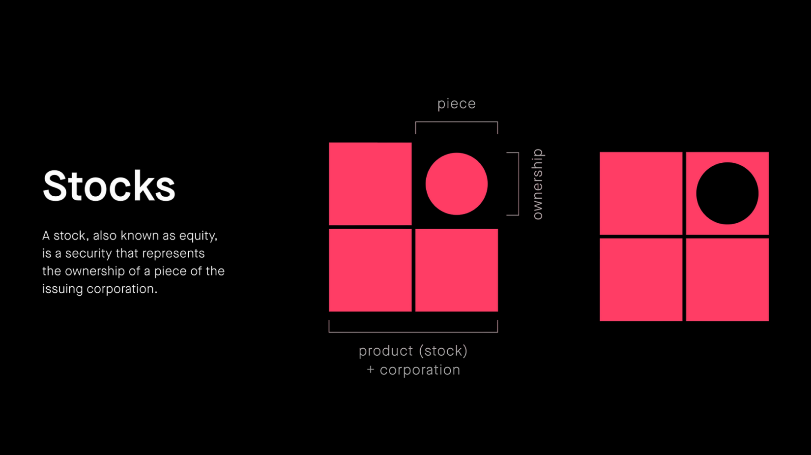
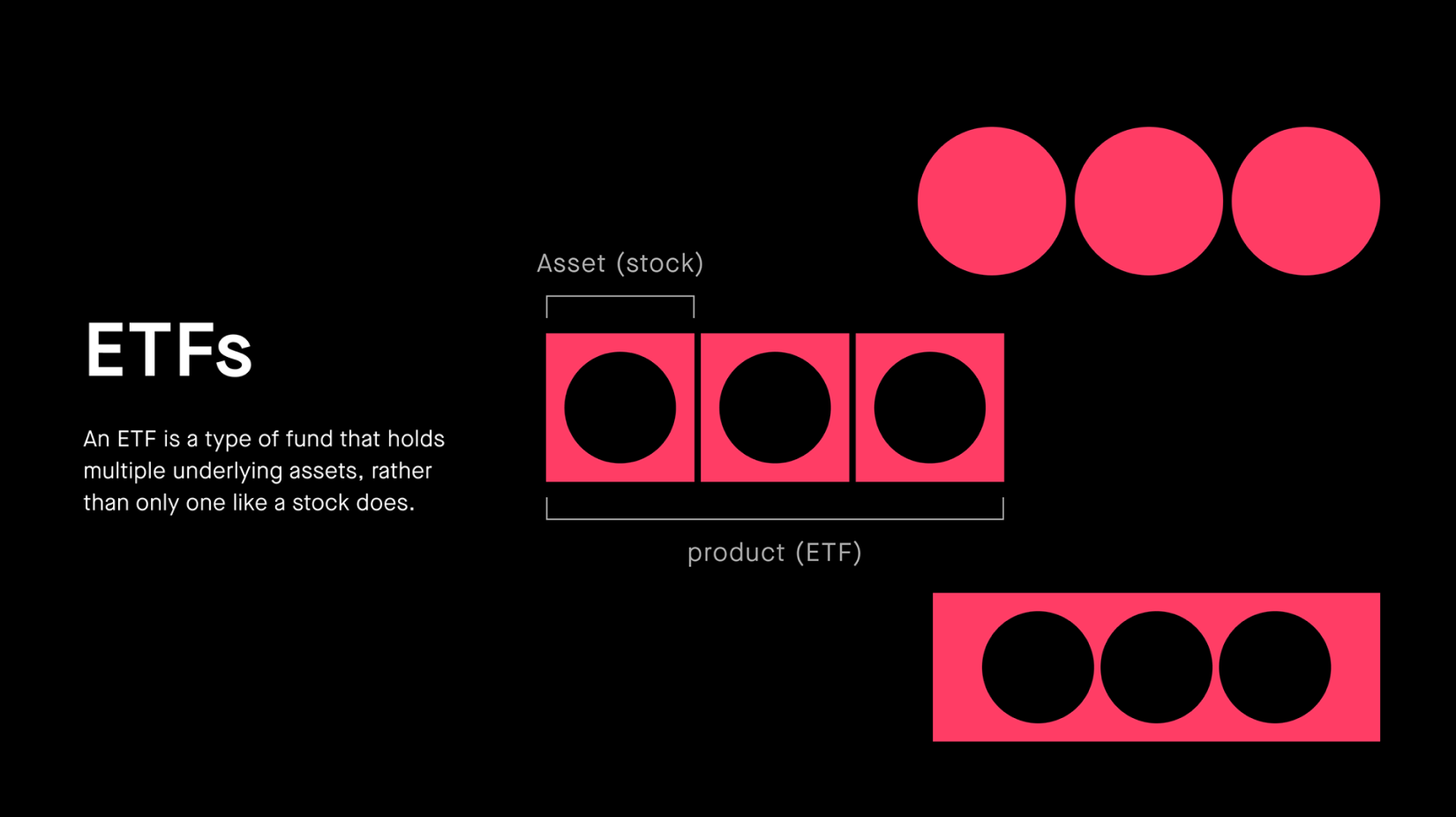
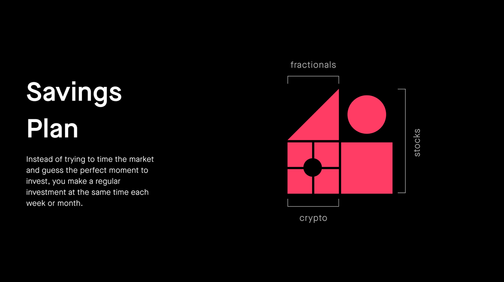
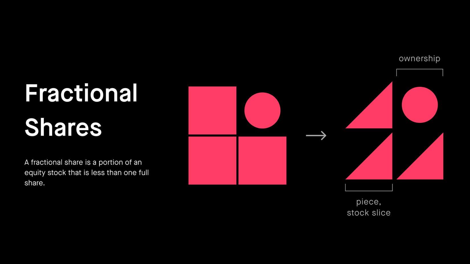
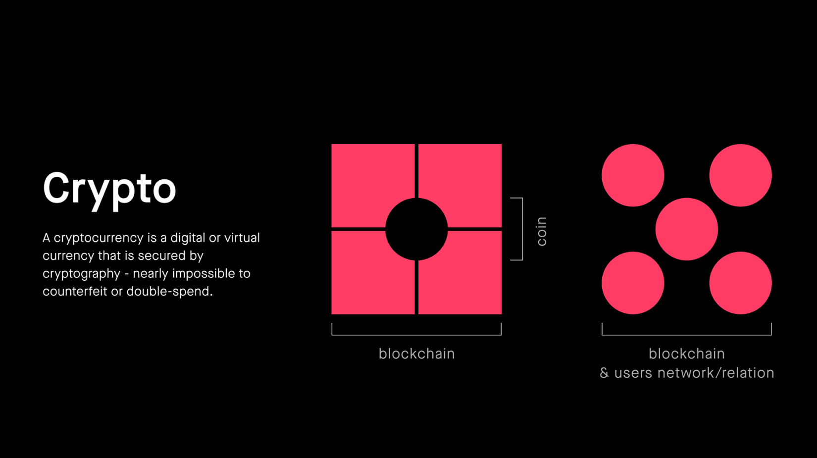
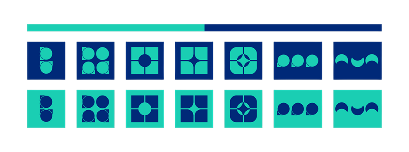
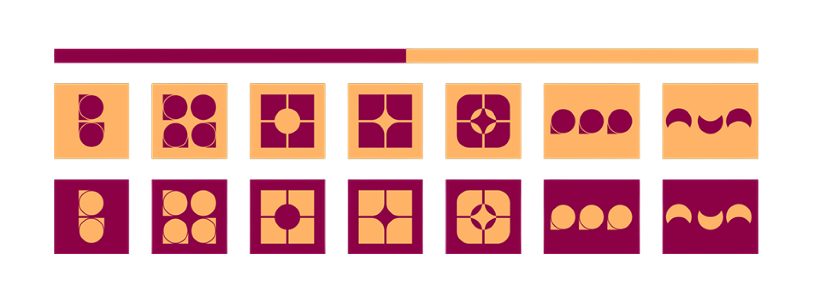
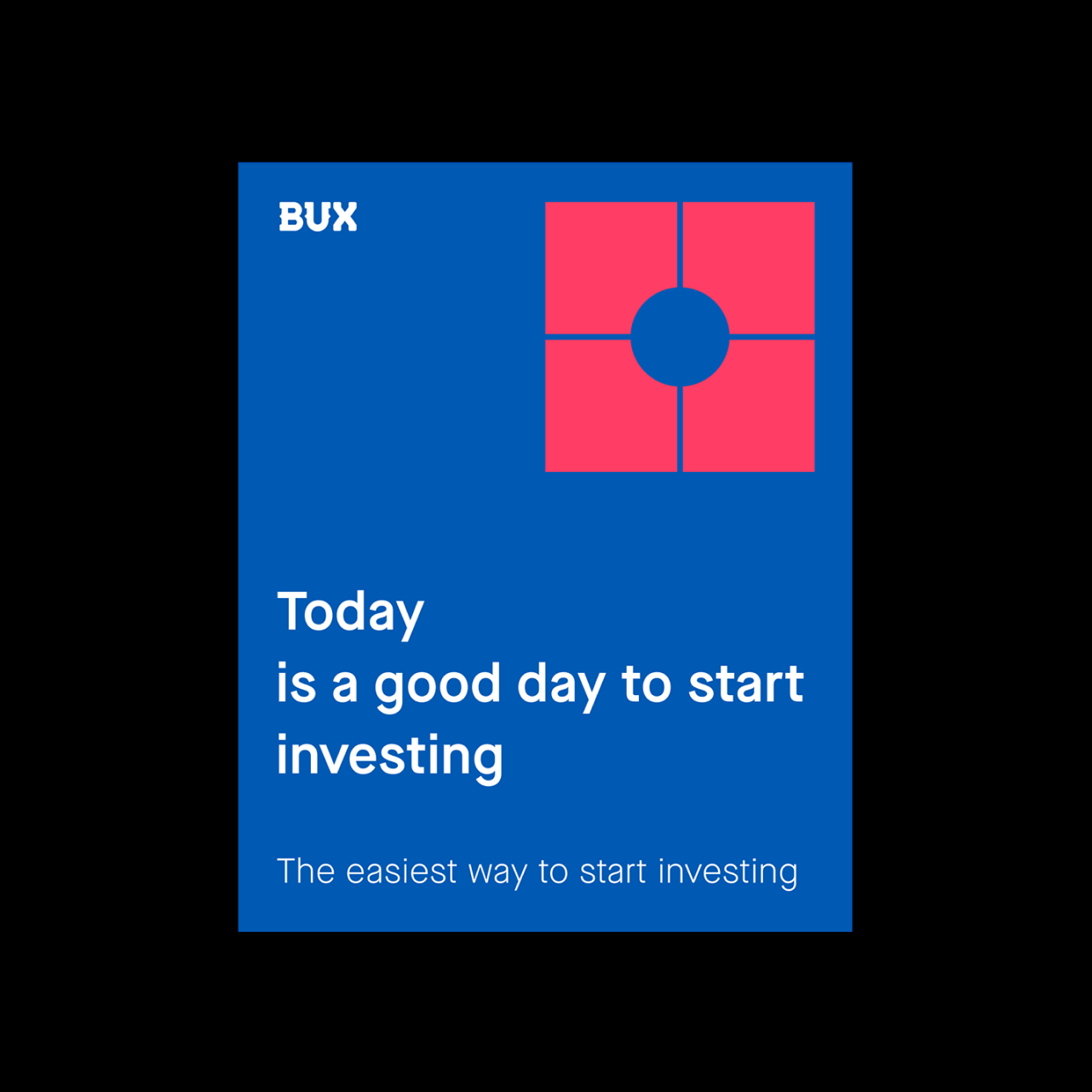
Rather than draw an icon per product, I designed a grammar and let the products spell themselves. Two shapes carry it. The square - stability, security and trust. Straight lines and right angles, a mathematical and balanced feel; rational, practical, conforming. The circle - unity, community and cyclic movement. It stands for BUX's continuous expansion of new assets. From there each product is a sentence rather than a symbol. Stocks: a grid of squares as the corporation, one circle lifted out of it - the piece you own. Fractional shares: the same squares split on the diagonal into slices, while the circle stays whole. The share is divided, the ownership isn't. You hold a smaller piece, not a lesser kind of ownership. Crypto is four blocks locked around a circular void: the blockchain, and at its centre the coin that only exists because of it. That circle is also you - the holder - because the circle never changes its meaning anywhere in the system. It also reads a third way: the network of users the chain actually runs on. One shape, three readings, all true at once. ETFs and savings plans resolve the same way, by composition rather than invention. A system is only a system if it outlives its author. Another designer should be able to build a device for a product that didn't exist yet, using only the square and the circle, without me in the room. If it needs a new shape, the grammar failed.
Approach - part II
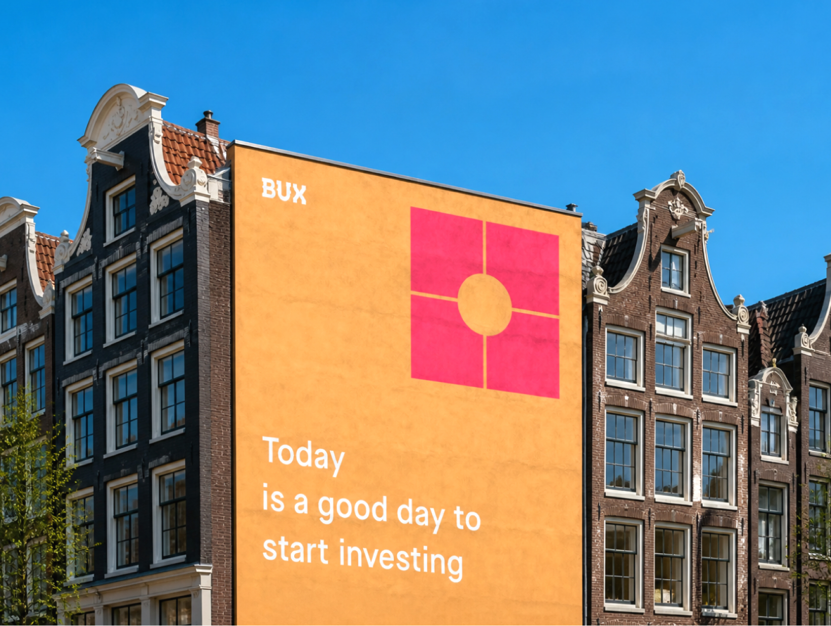
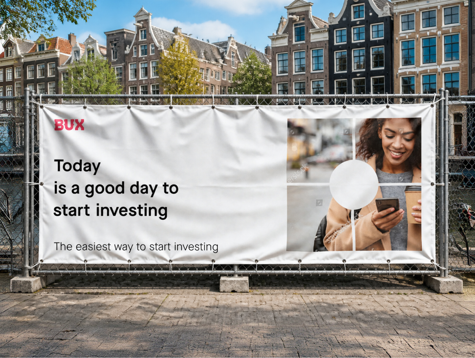
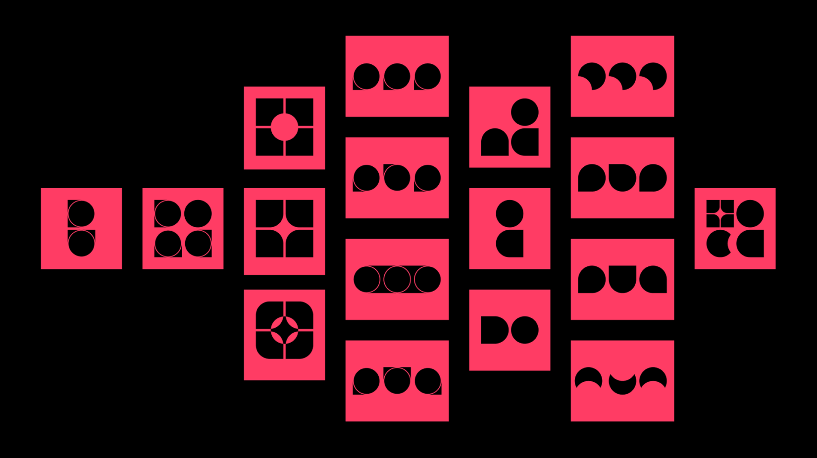
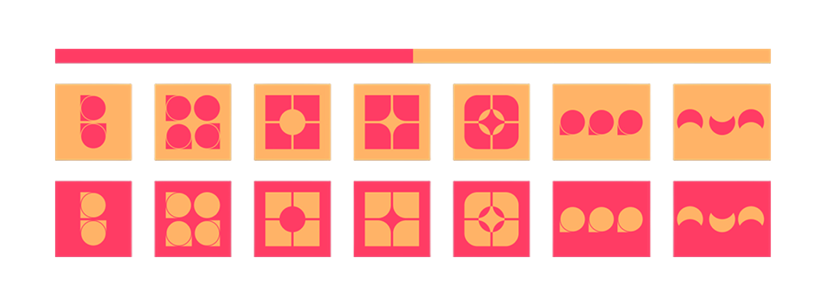
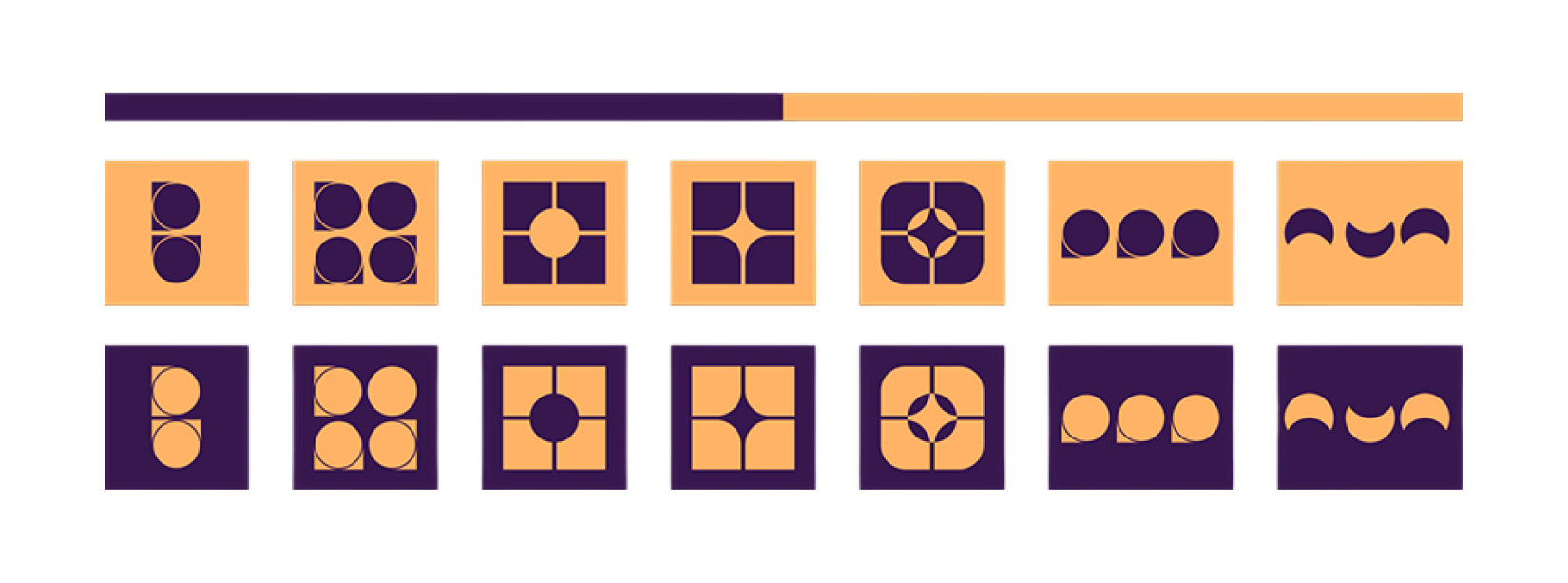
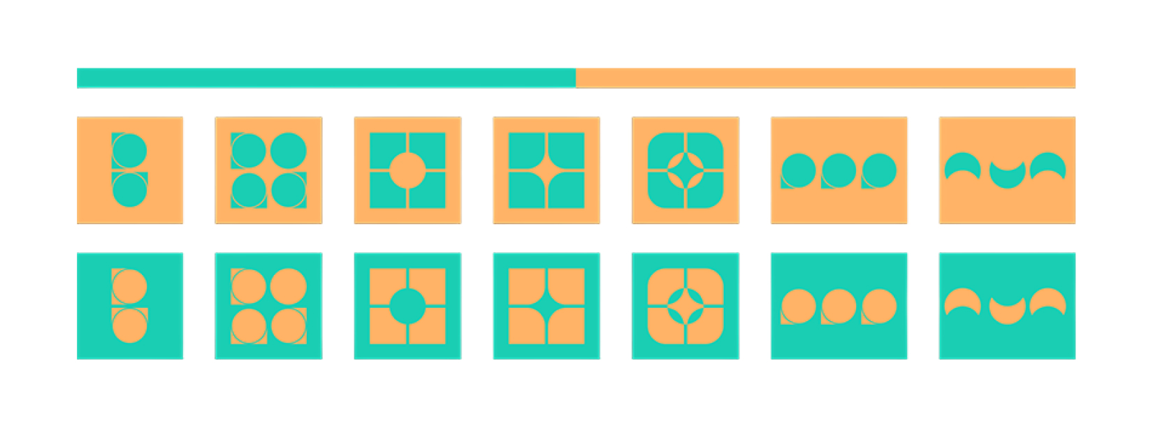
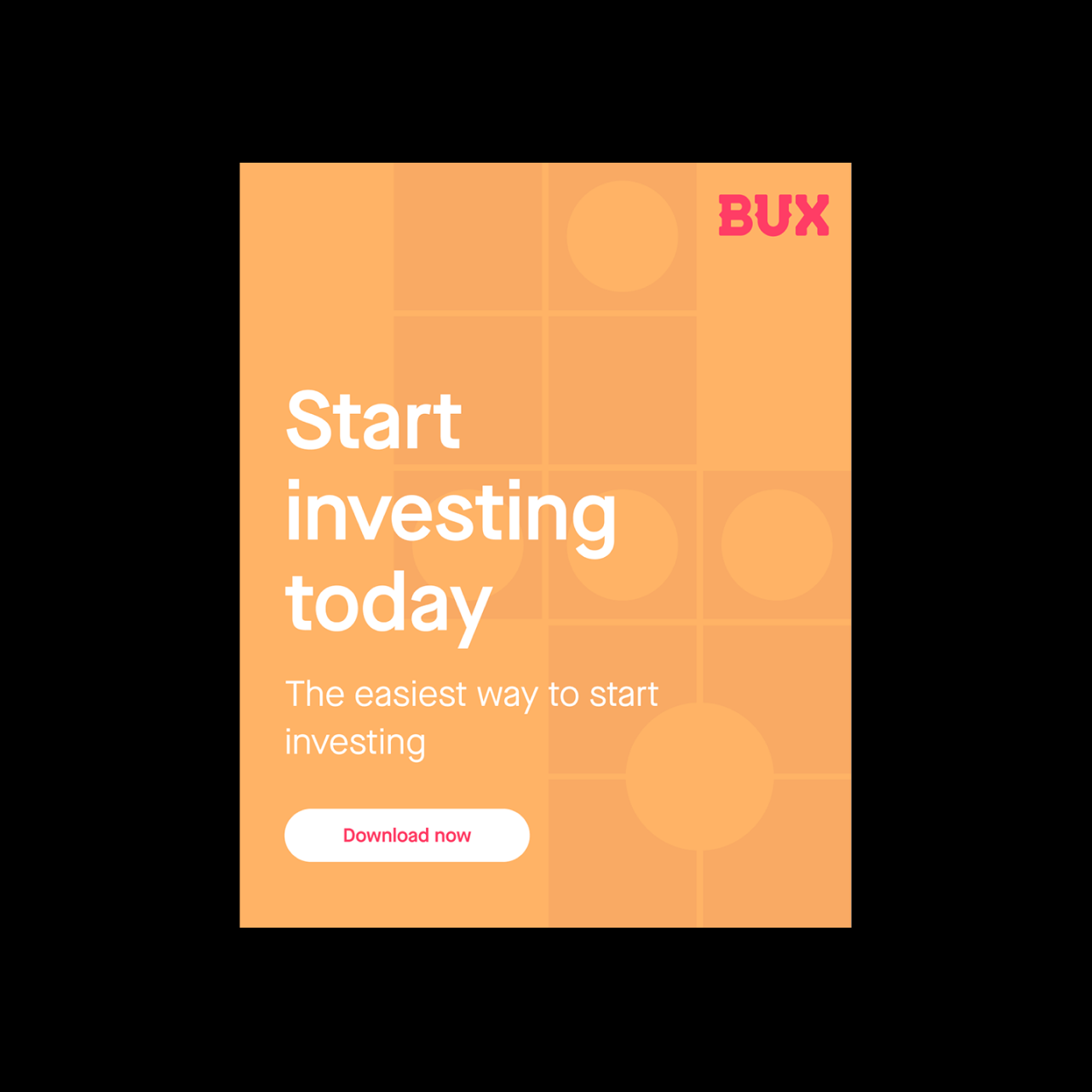
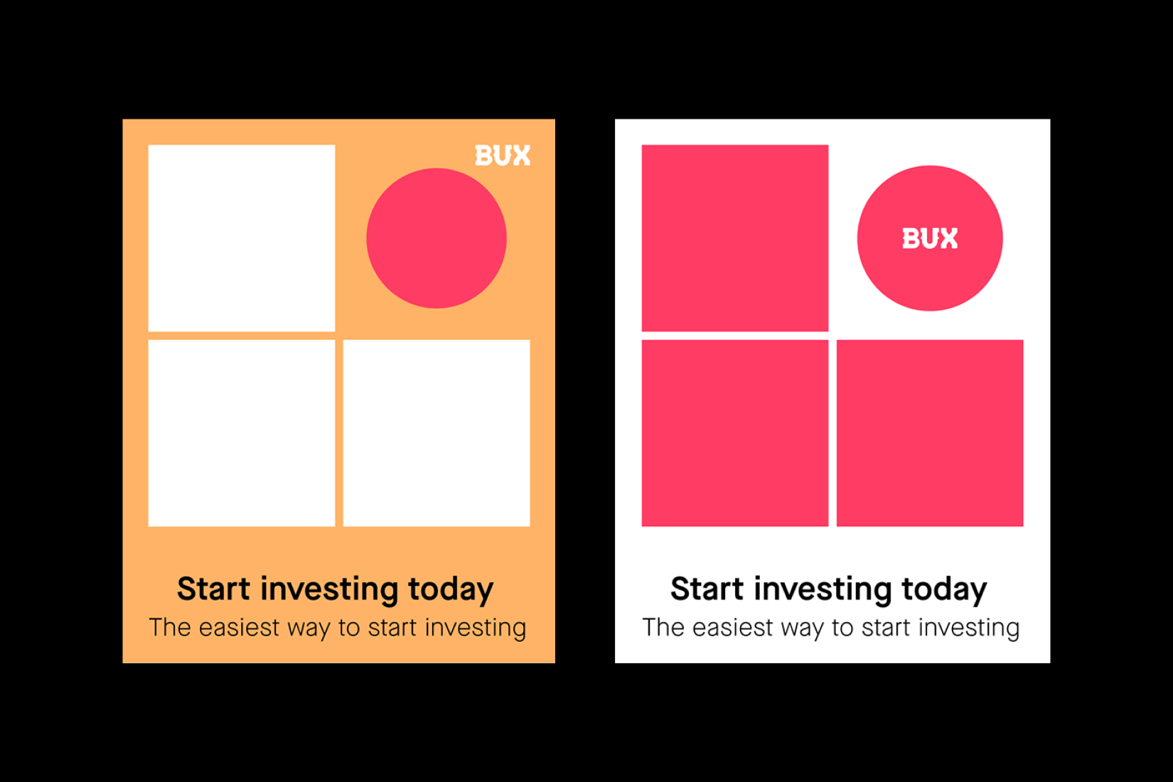
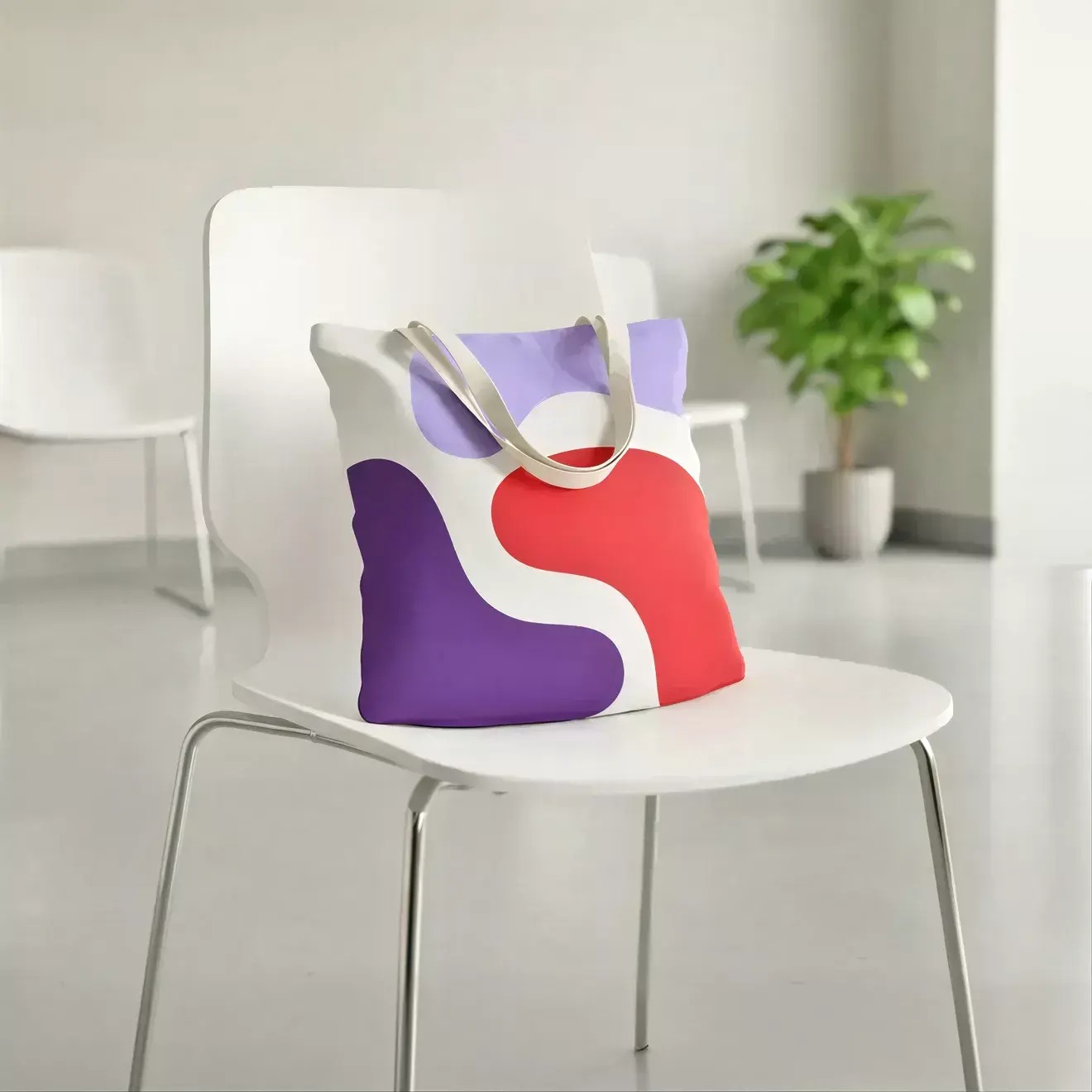
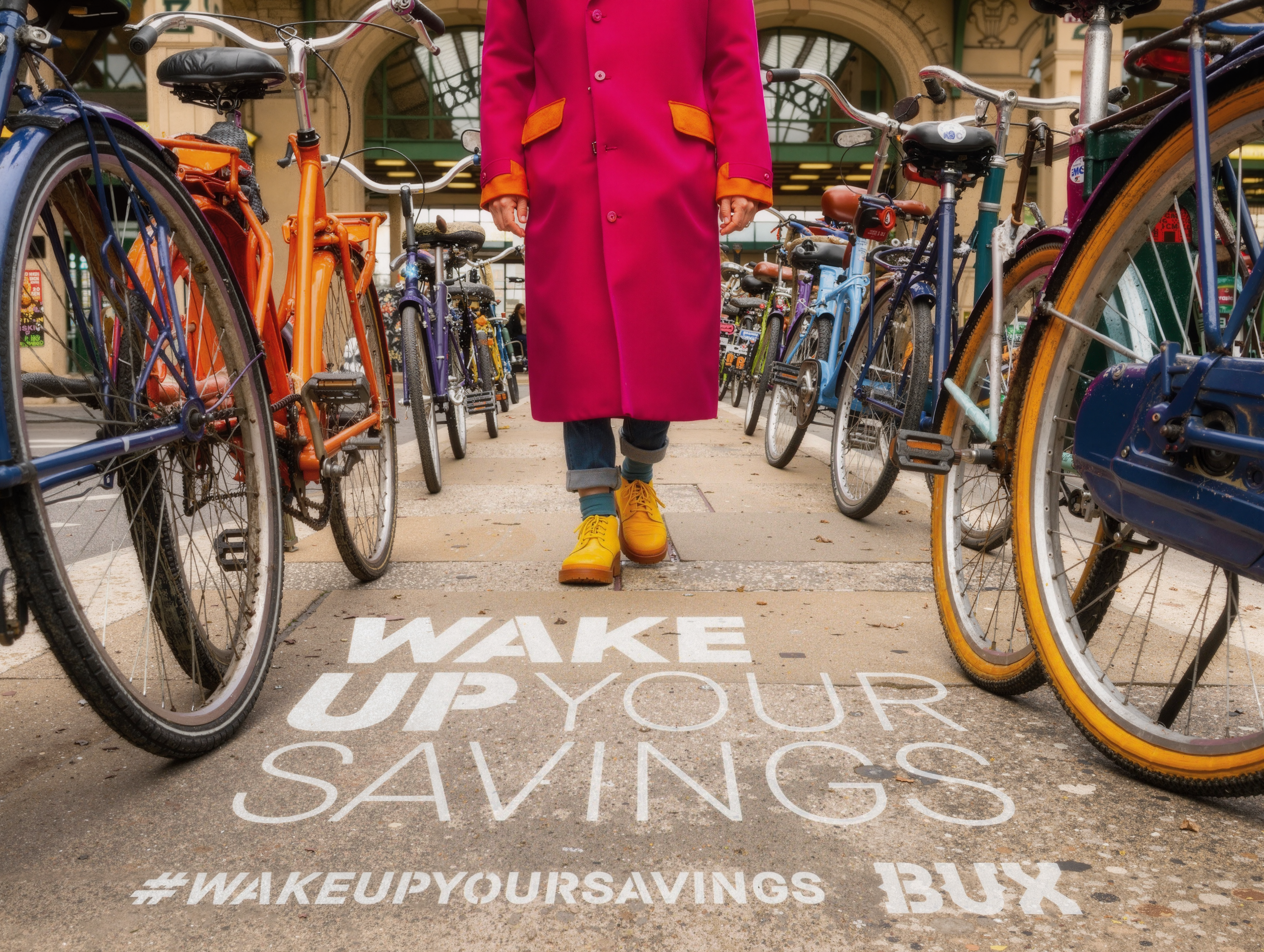
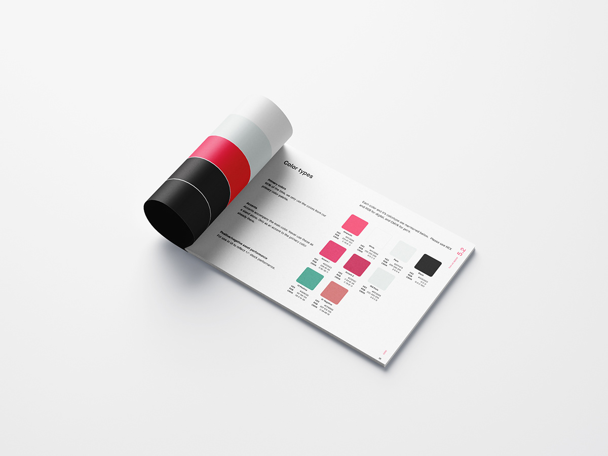
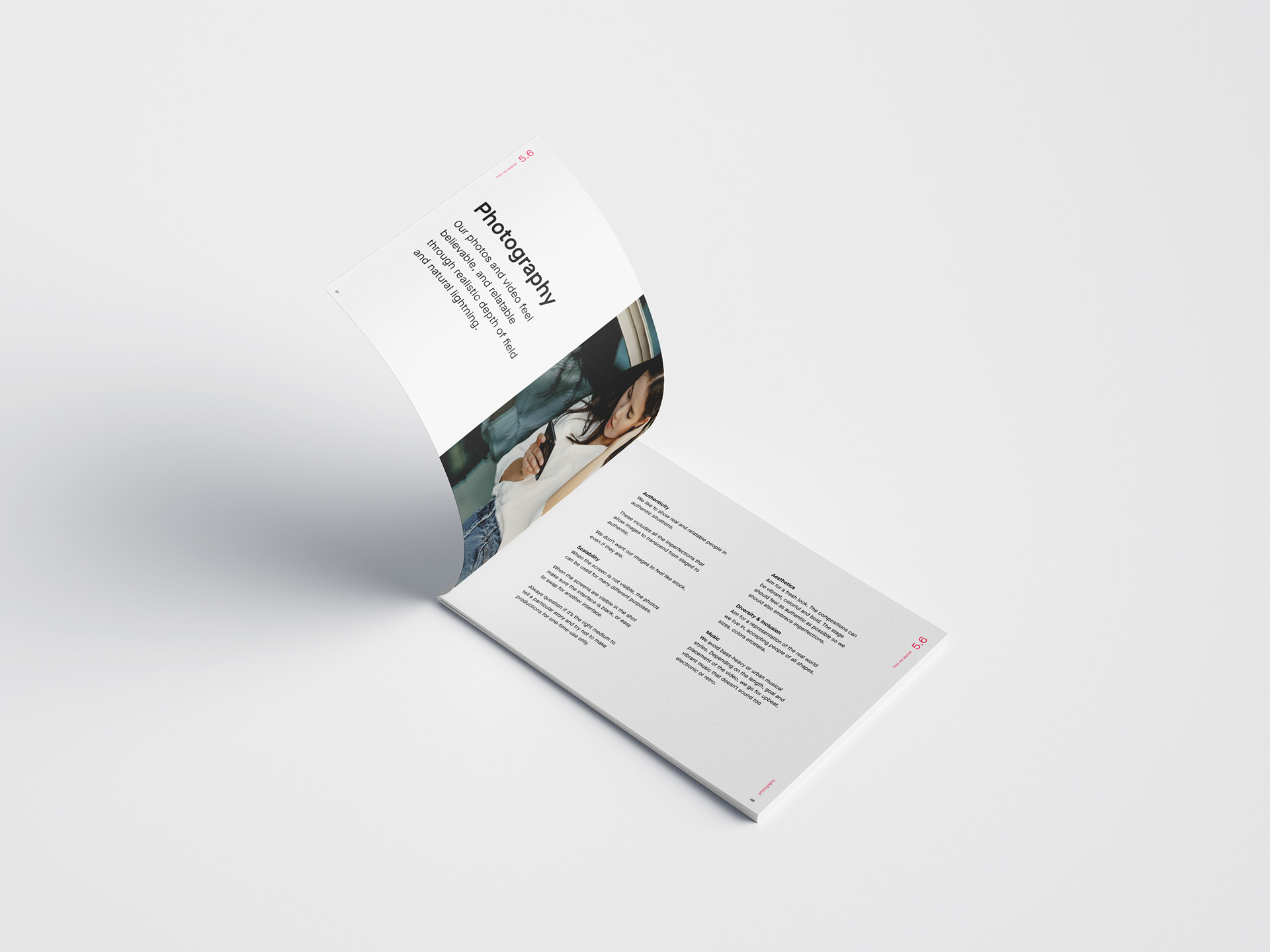
A grammar is only worth having if it flexes. I stress-tested the system across roundness and stroke weight - from hard geometric through outlined to fully rounded - to find how far the shapes could bend before the meaning broke. They bend less than you'd want them to. Rounding the square softens exactly the property it was chosen for: the right angle is the stability. And past a certain radius the square and the circle stop being two distinct signs, which collapses a system of two into a system of one. The system holds at hard geometry and solid fills, and the warmth BUX needs is carried by colour and composition instead. Charm was the cheaper thing to give up, legibility was the whole asset. Colour was tested the same way, but the palette was found rather than invented. Amaranth is BUX's primary colour and the devices are native to it. The secondaries I paired it with - the teals, blues, aubergine, sand and maroon - were already in use across BUX's illustrations. Pulling them in was the whole point: it kept the devices inside the brand's existing colour reality instead of opening a second visual world that the illustration work would have to be reconciled with later. Built as two-tone pairs, each device holds up in any of those combinations, because the meaning lives in the geometry rather than the colour. The palette can move, the language doesn't. And because the devices are built on a grid, that grid doubles as a mask. Photography drops into the same square-and-circle structure, which stops imagery and iconography competing and makes them one voice. Applied, it scales down to posters, performance banners, app-store cards, social, out-of-home and in-app education.
Impact
The system gave BUX something a style can't: an argument. Every shape decision traced back to a product truth, which moves a brand conversation from taste to logic - and logic is the only currency that travels in a company where design sits between product, marketing and compliance. It also made the offer visible. Mapping stocks, ETFs, crypto, fractionals and savings plans as one constructed family put BUX's product hierarchy into a single frame for the first time, and made the pioneering end of the range - the part regular brokers don't have - the most visually distinctive part of the brand rather than a footnote in the copy. The wider proposition is the one I'd take to any abstract product: a brand this intangible doesn't have to borrow its imagery from the category. Given few enough parts and a strict enough grammar, it can build its own. Everything it makes afterwards is legible for a reason, not just consistent by rule.