Health starts in your guts
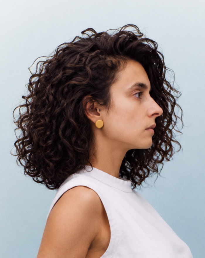
Portrait of Irene Martins Irene Martins © Design lead

I’m a Design Lead and designer, based in Amsterdam. Worked with Blijdorp Rotterdam Zoo, Woven Capital (Toyota) and MDL Fonds. With 13+ years between agency and in-house, I craft brands, products and campaigns by creating identities and systems that hold them together. Today, I’m also leading the people behind them. View resume.

Health starts in your guts, MDL Fonds, 2024
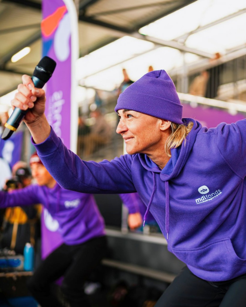
MDL Fonds brand hero

The project scope

360° rebrand, strategy, design systems, website, socials. Role as Creative Director and Designer.

The scenario

1 in 4 Dutch people lives with a condition affecting their stomach, intestines, liver, or pancreas - not a niche statistic, but a national reality. And yet, for decades, the conversation around gastrointestinal health remained quiet, stigmatised, and largely invisible. Having raised close to 20 million funds over the last 2 years to scientific research and treatments that aim to improve people's lives, Maag Darm Lever Stichting needed to stop presenting itself as a passive fund. As advocates for better healthcare, it was time for Maag Darm Lever Stichting to own its role as the leading force in gastrointestinal health in the Netherlands - and we, DPDK, were all in for it.

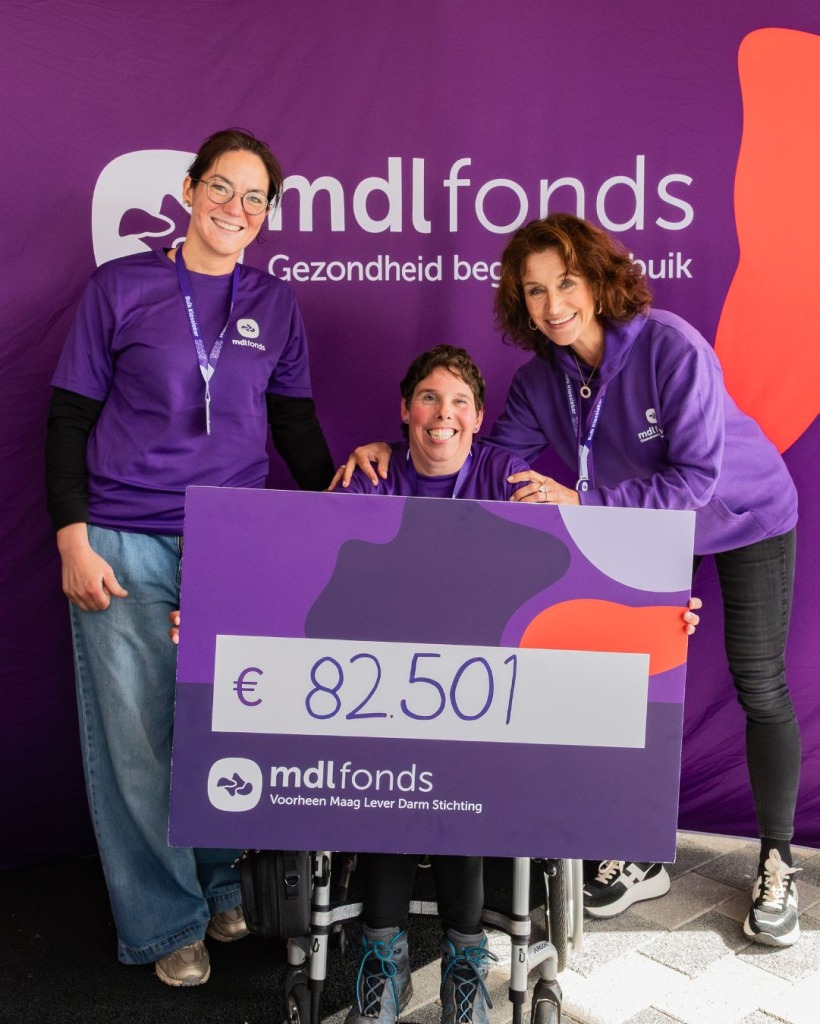
MDL Fonds identity system
MDL Fonds identity detail

The approach

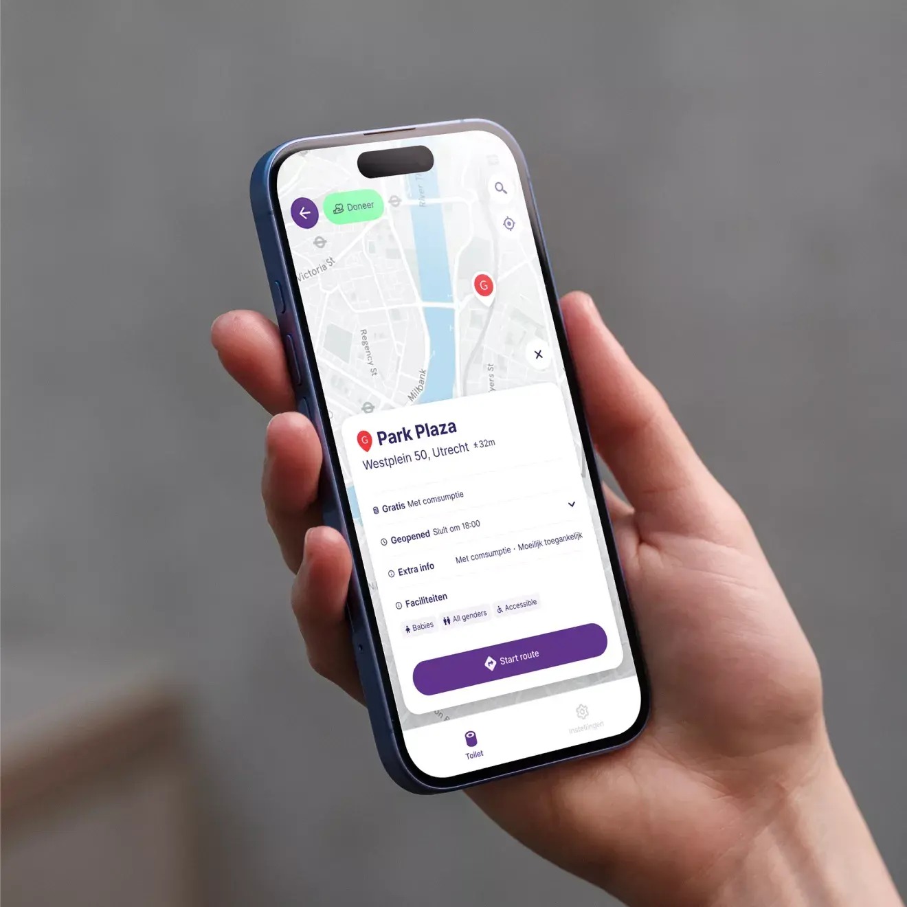
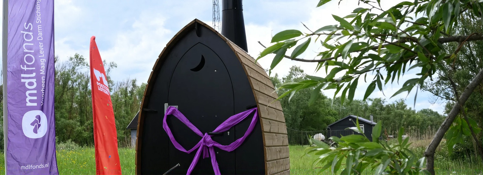
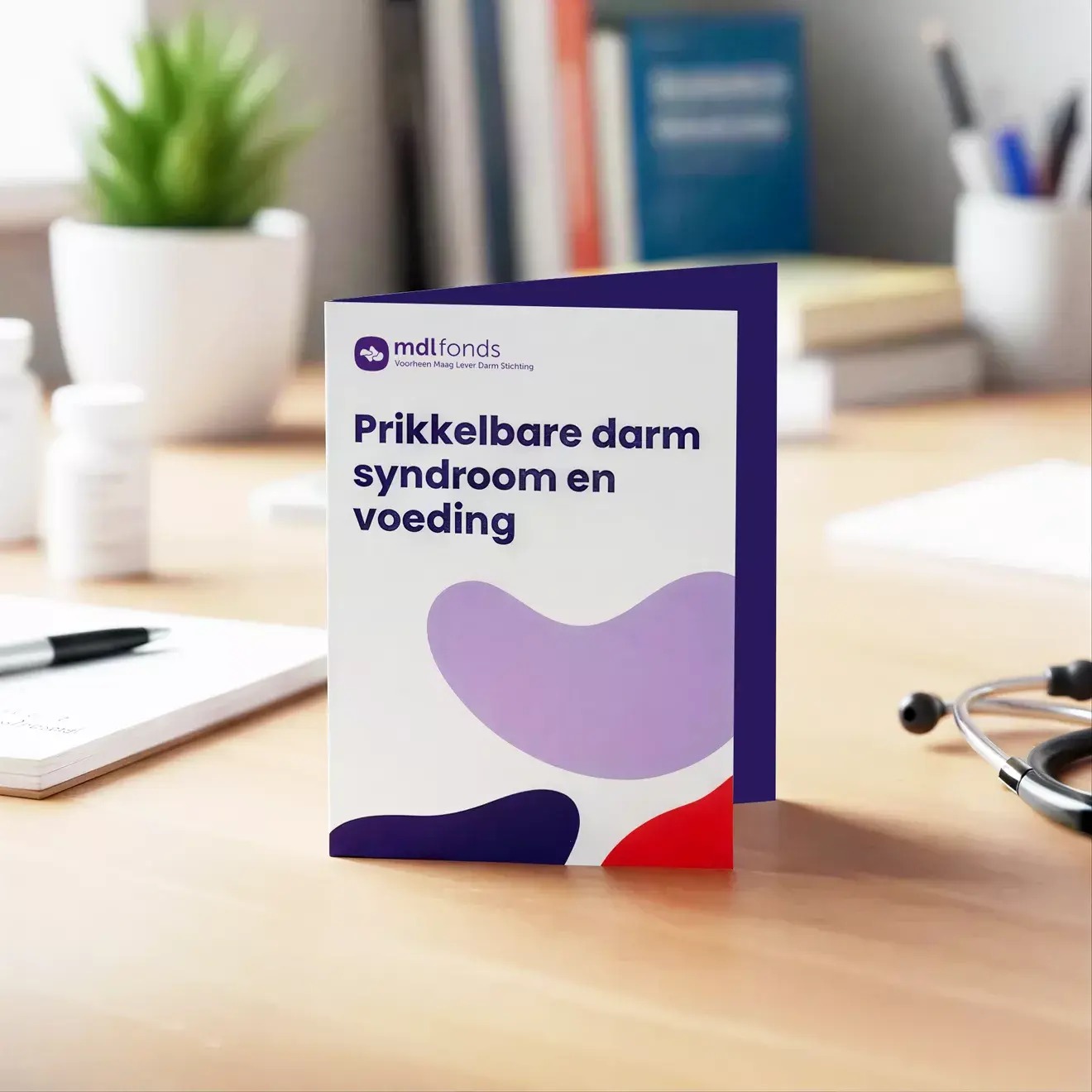
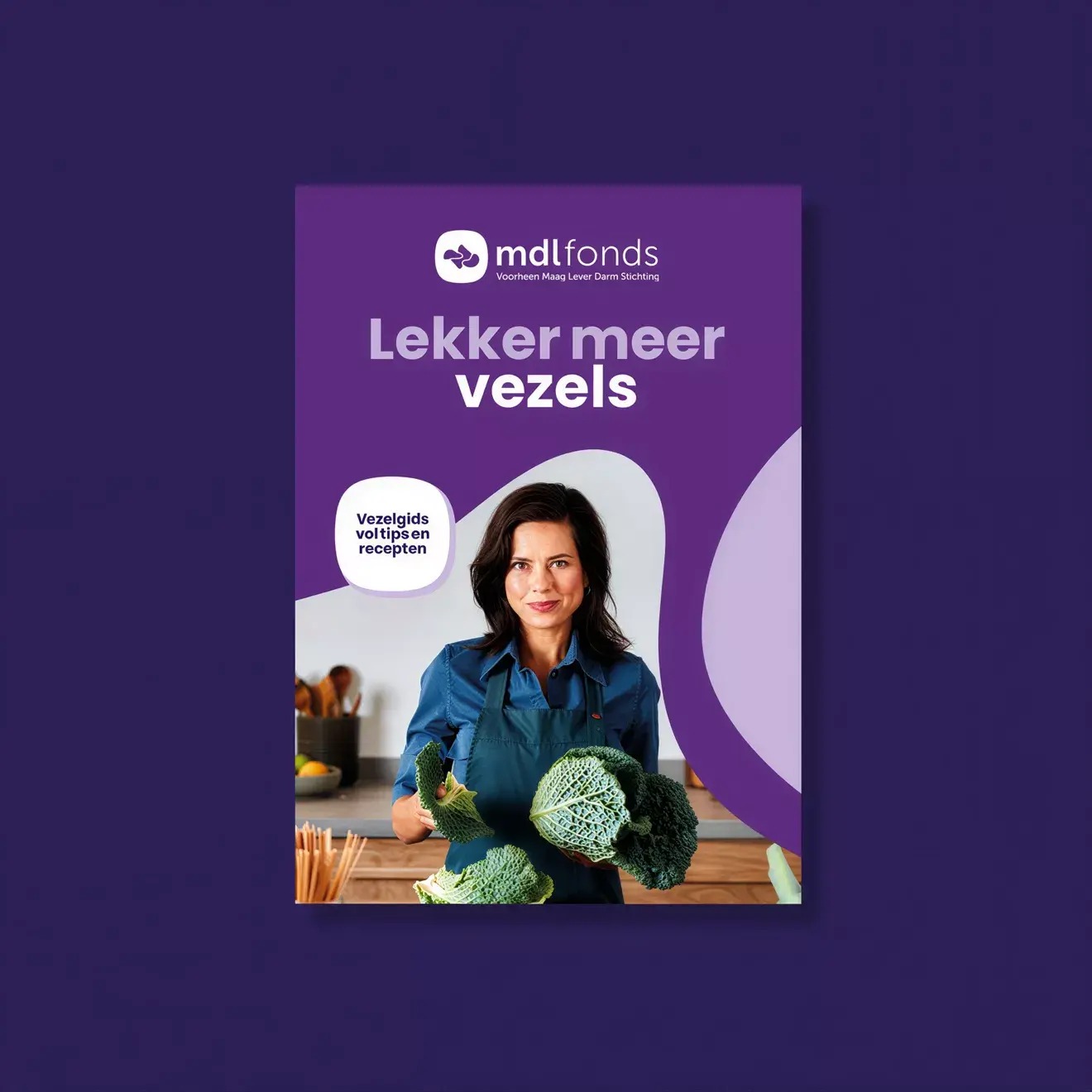
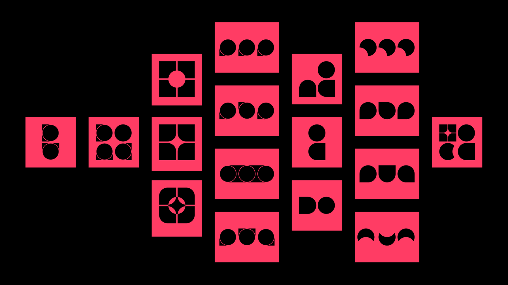
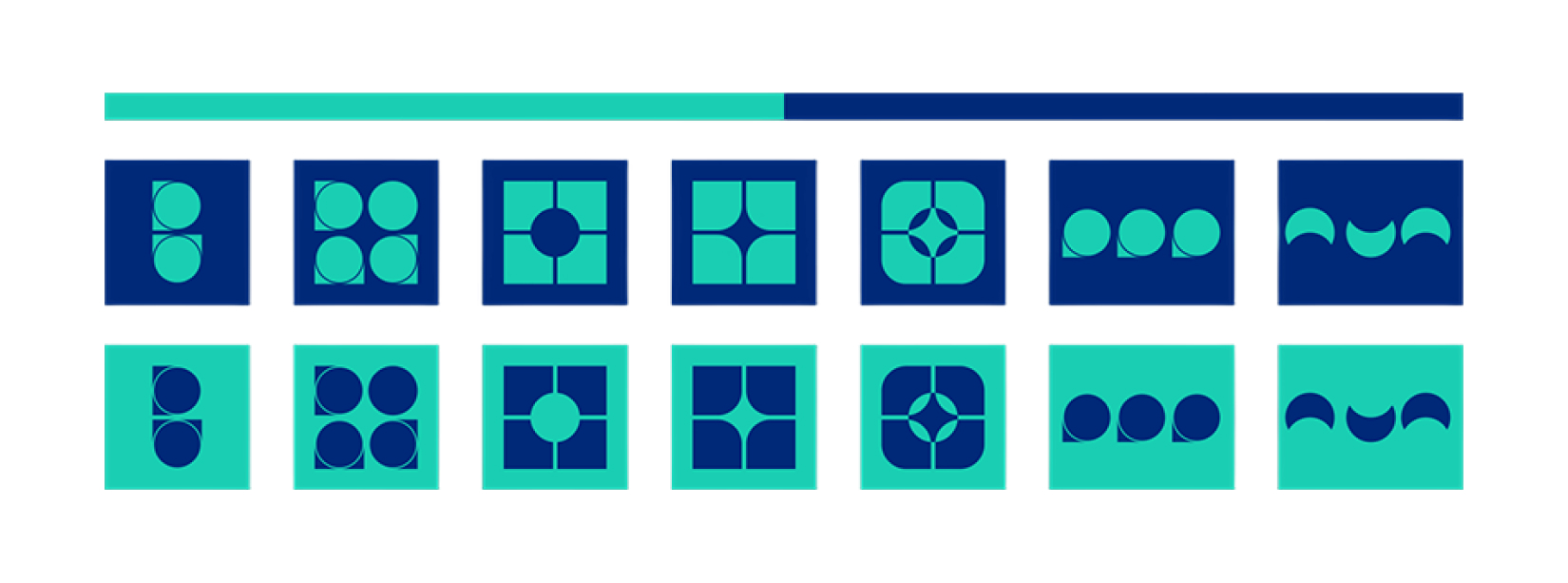
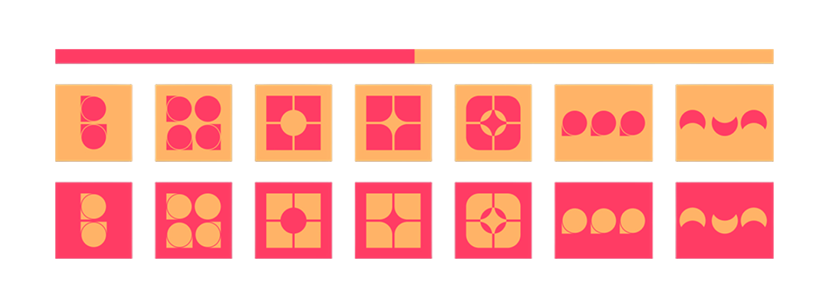
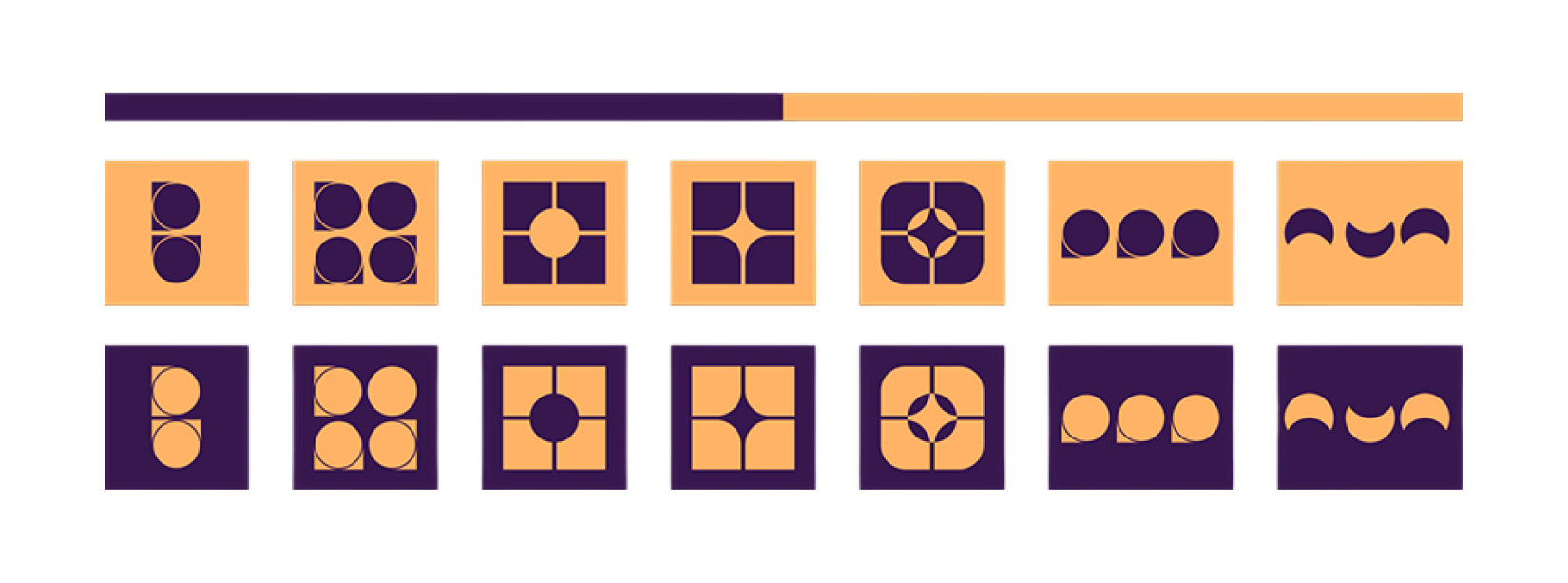
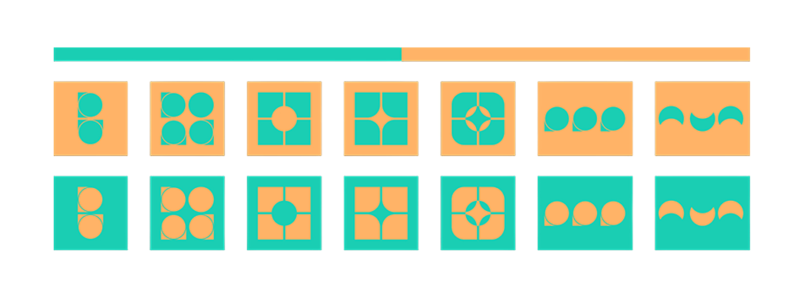
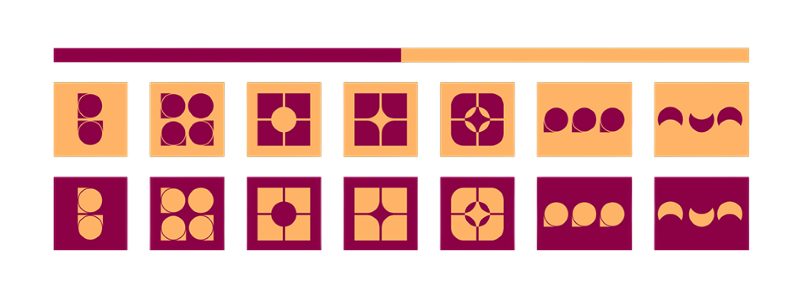
DPDK brought into the table full repositioning - strategy, identity, name, and everything in between. Maag Darm Lever Stichting became MDL Fonds and a new scalable, approachable and human brand has emerged. The identity earns its distinctiveness from the inside out and was built around a single creative decision: the logo itself is formed by the three organs at the heart of the digestive system - stomach, intestines, liver - abstracted into a mark that is both medical in meaning and bold in form. A system of patterns was derived to carry the identity across every surface - from the brand book and website to merchandise, communications, apps, public toilets and national events - turning biology into visual language. MDL Fonds brand doesn't just talk about the body, but it's an identity colourfully shaped by it.

It's a brand story human enough to feel. Loud enough to matter.
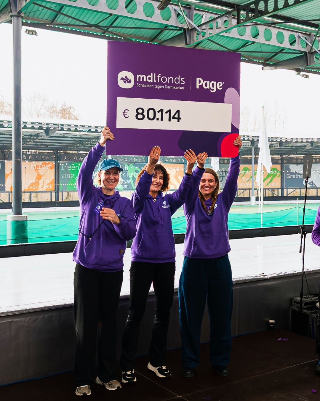
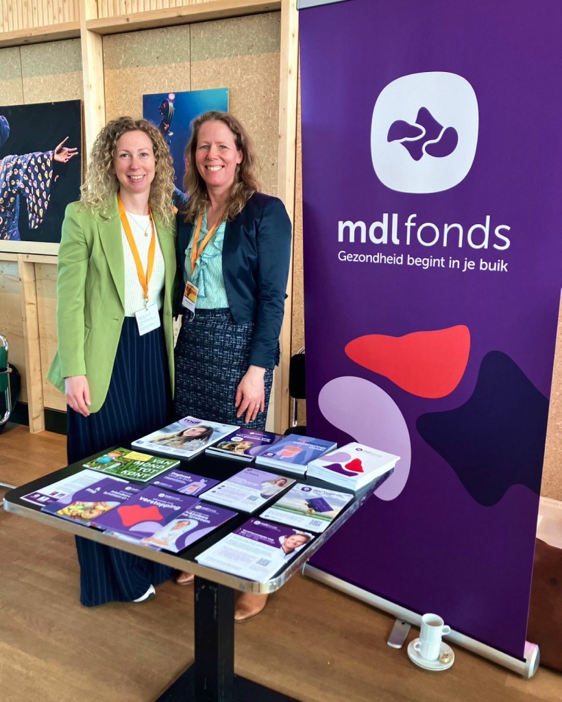
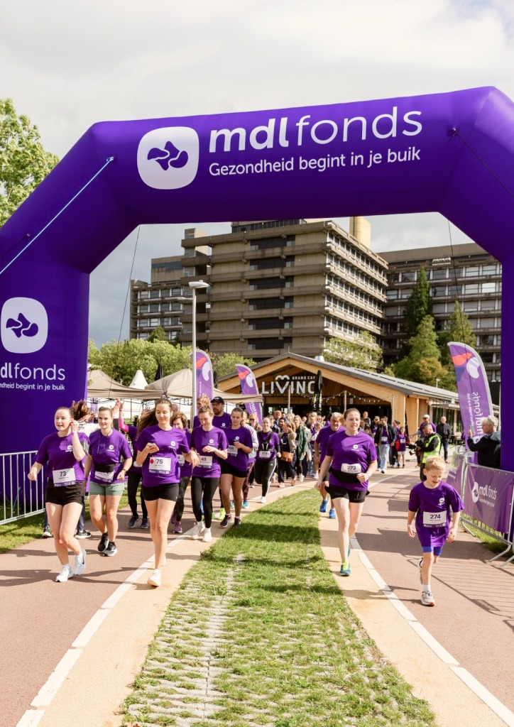
MDL Fonds brand application

The impact

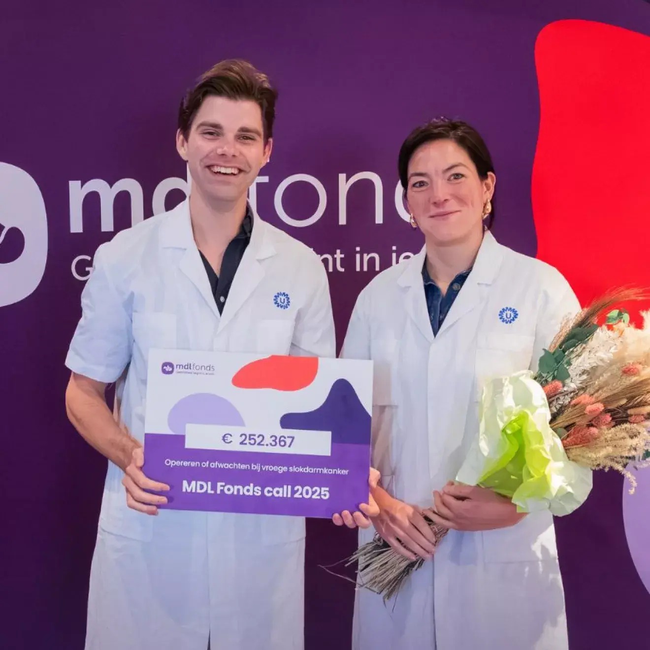
MDL Fonds launched not as a fund asking for donations, but as a movement across the Netherlands. One unified and powerful brand story now travels across every touchpoint - campaigns, hospitals, and fundraising platforms, replacing years of fragmentation and giving gastrointestinal health a presence it never had before. What was once a quiet, clinical fund has become a bold, human voice - proof that even the parts of us we don't like to talk about deserve an identity worth paying attention to.

MDL Fonds brand in context
MDL Fonds brand application
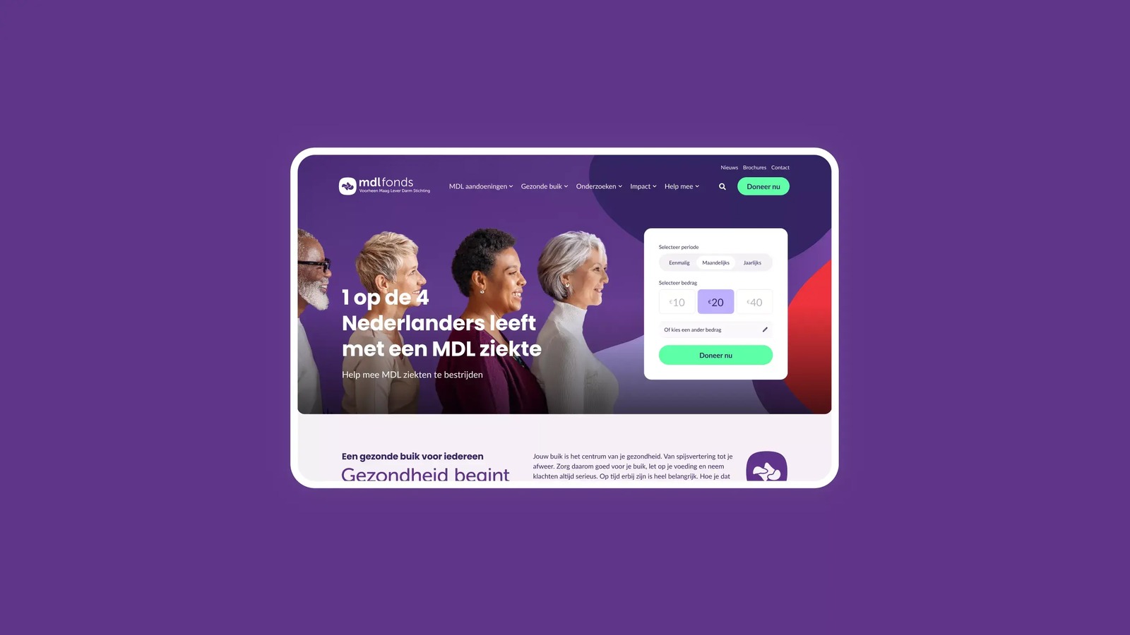
MDL Fonds website funding section
MDL Fonds brand application
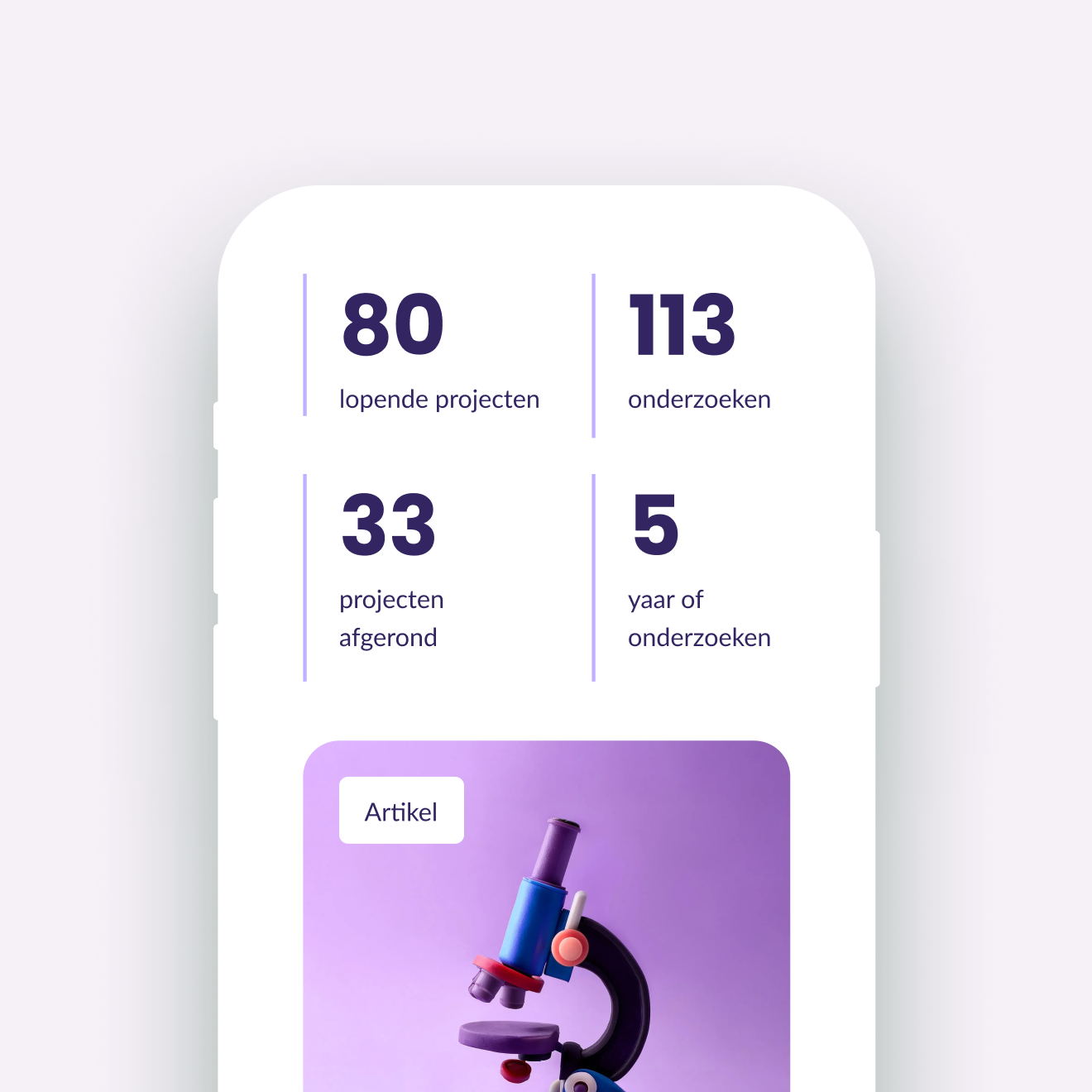
MDL Fonds website stats on mobile
MDL Fonds brand application
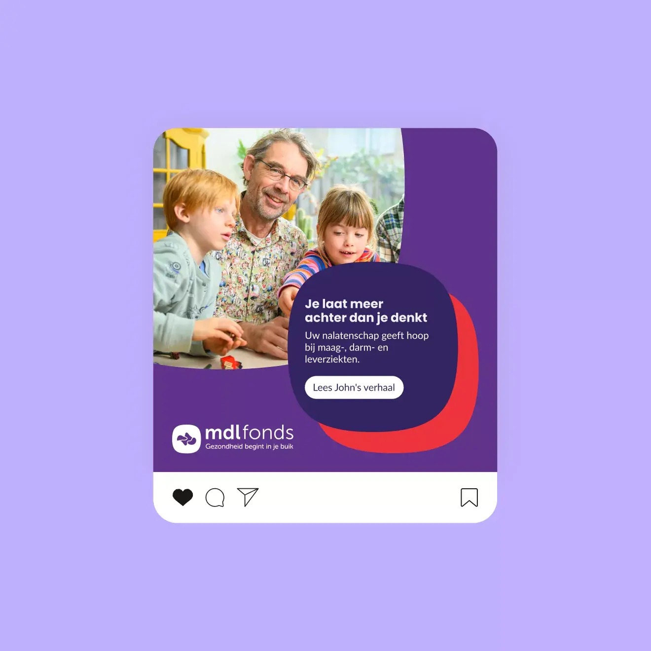
MDL Fonds brand campaign
MDL Fonds brand application

The extra design mile

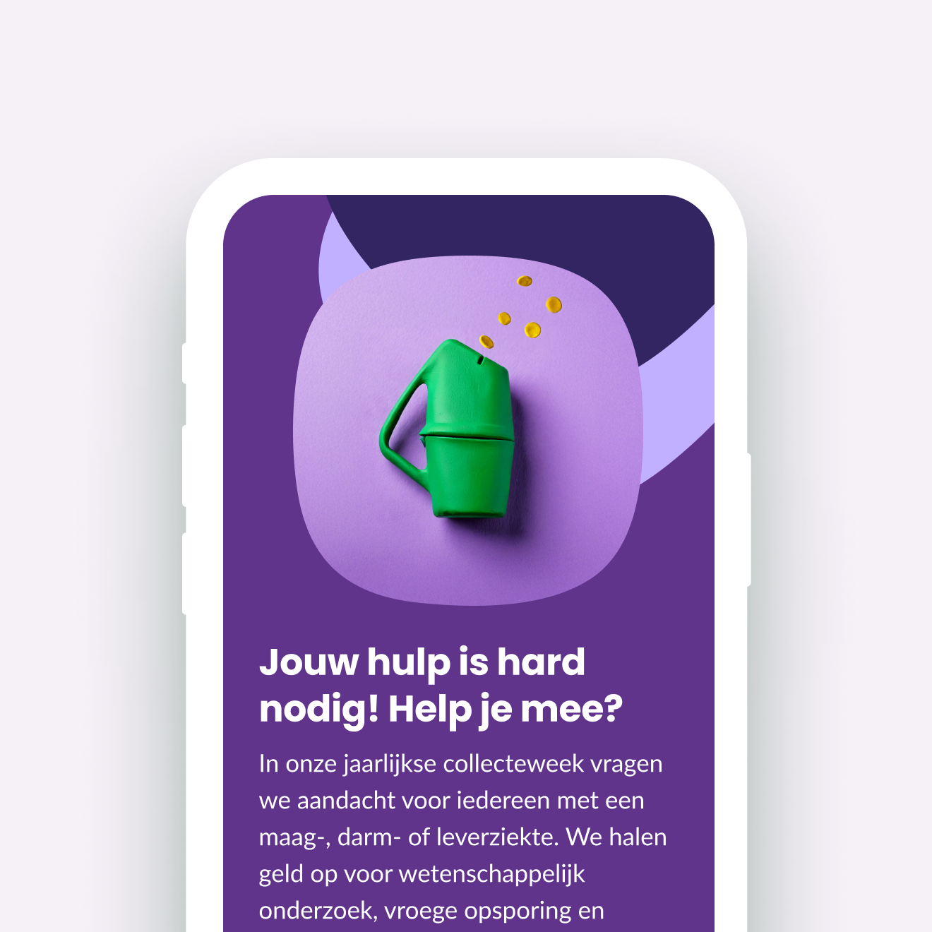
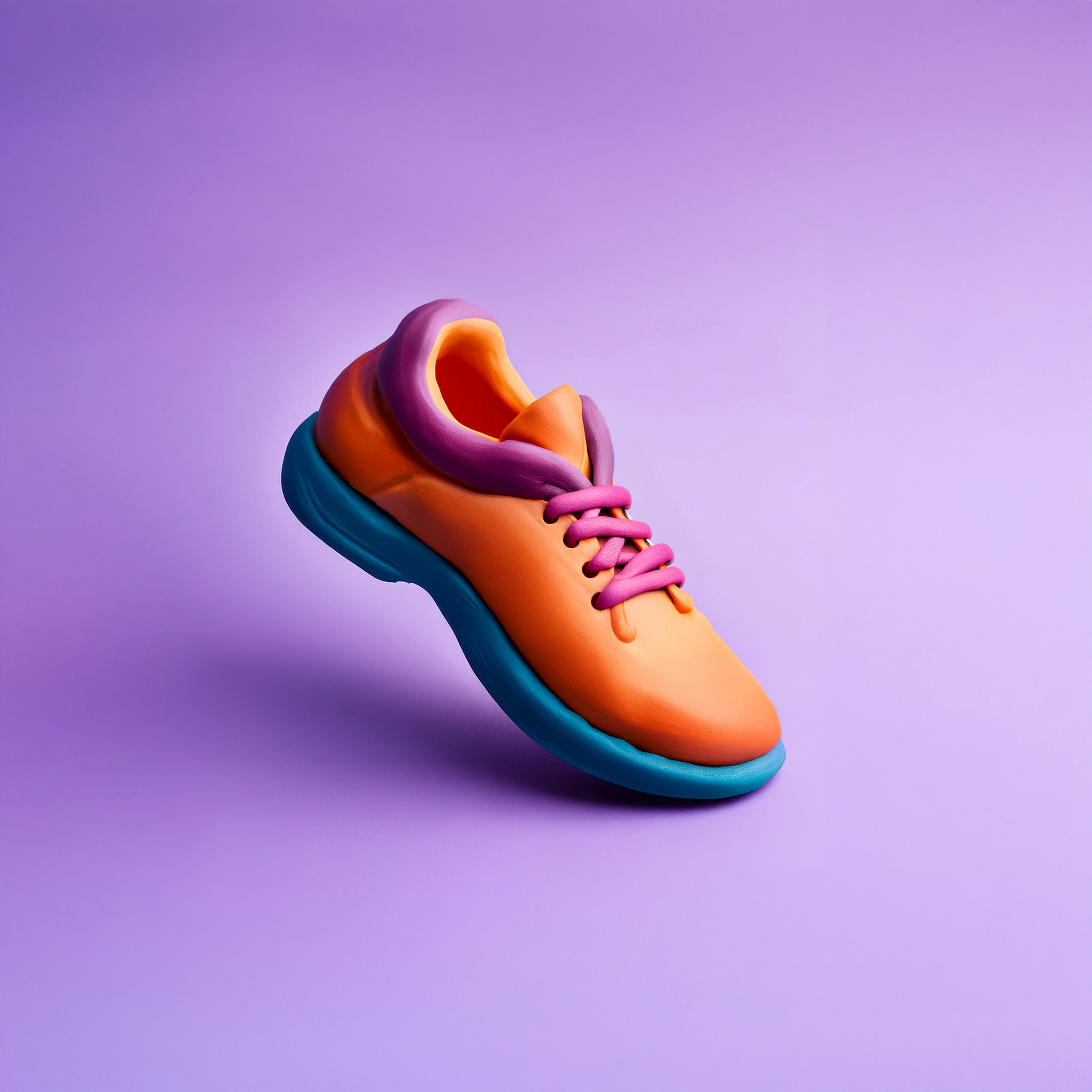
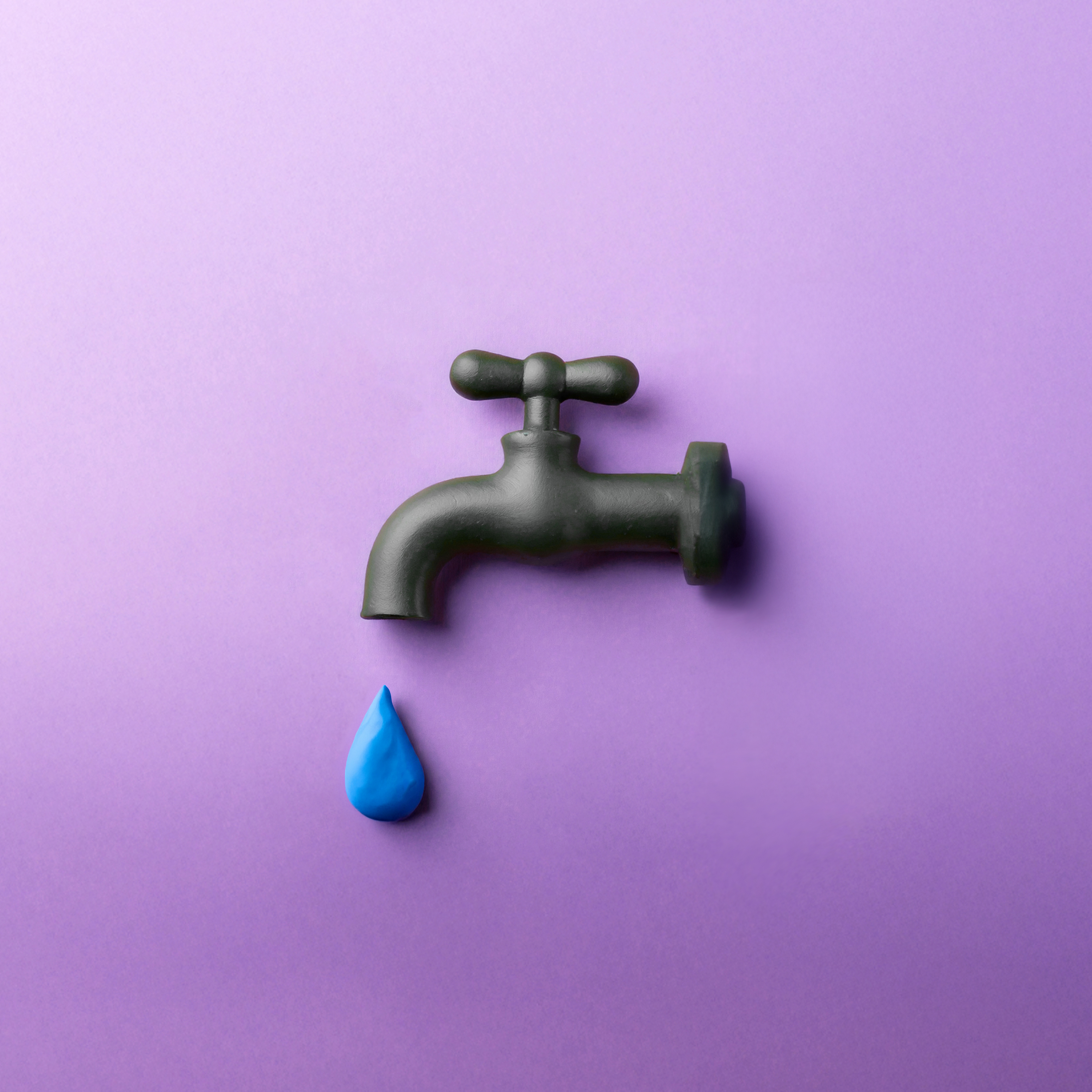
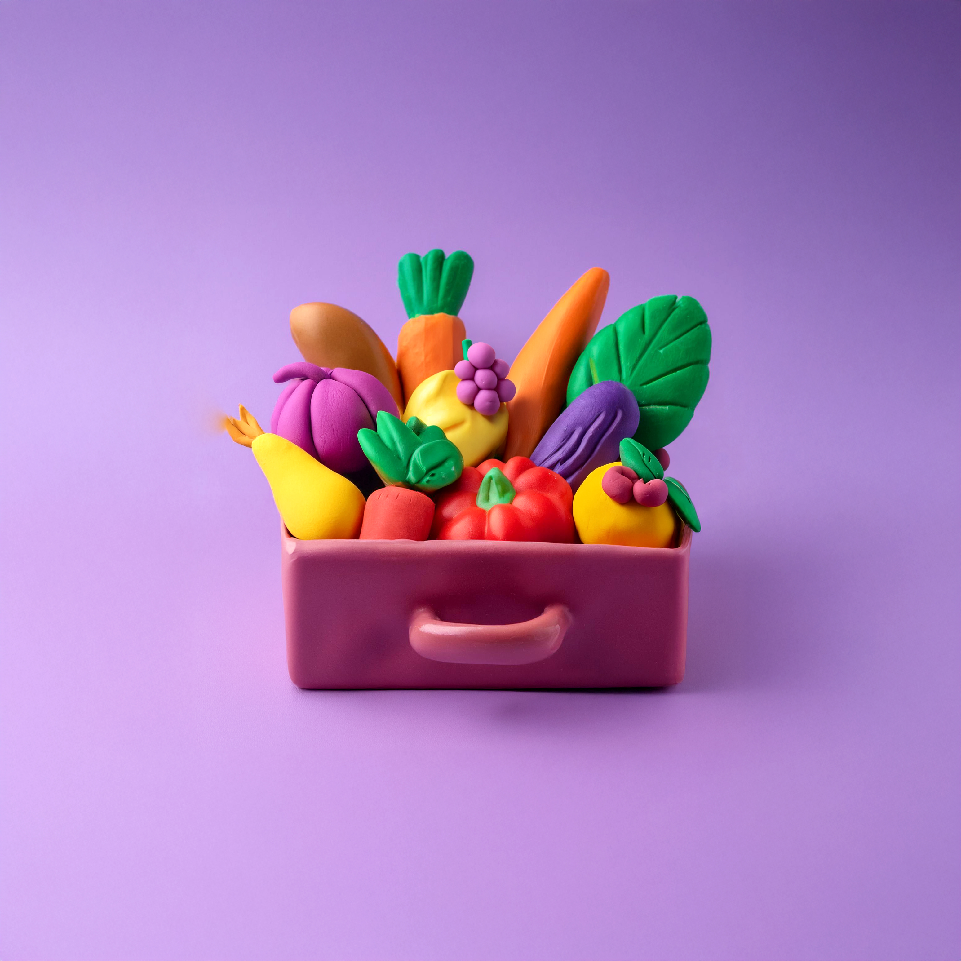
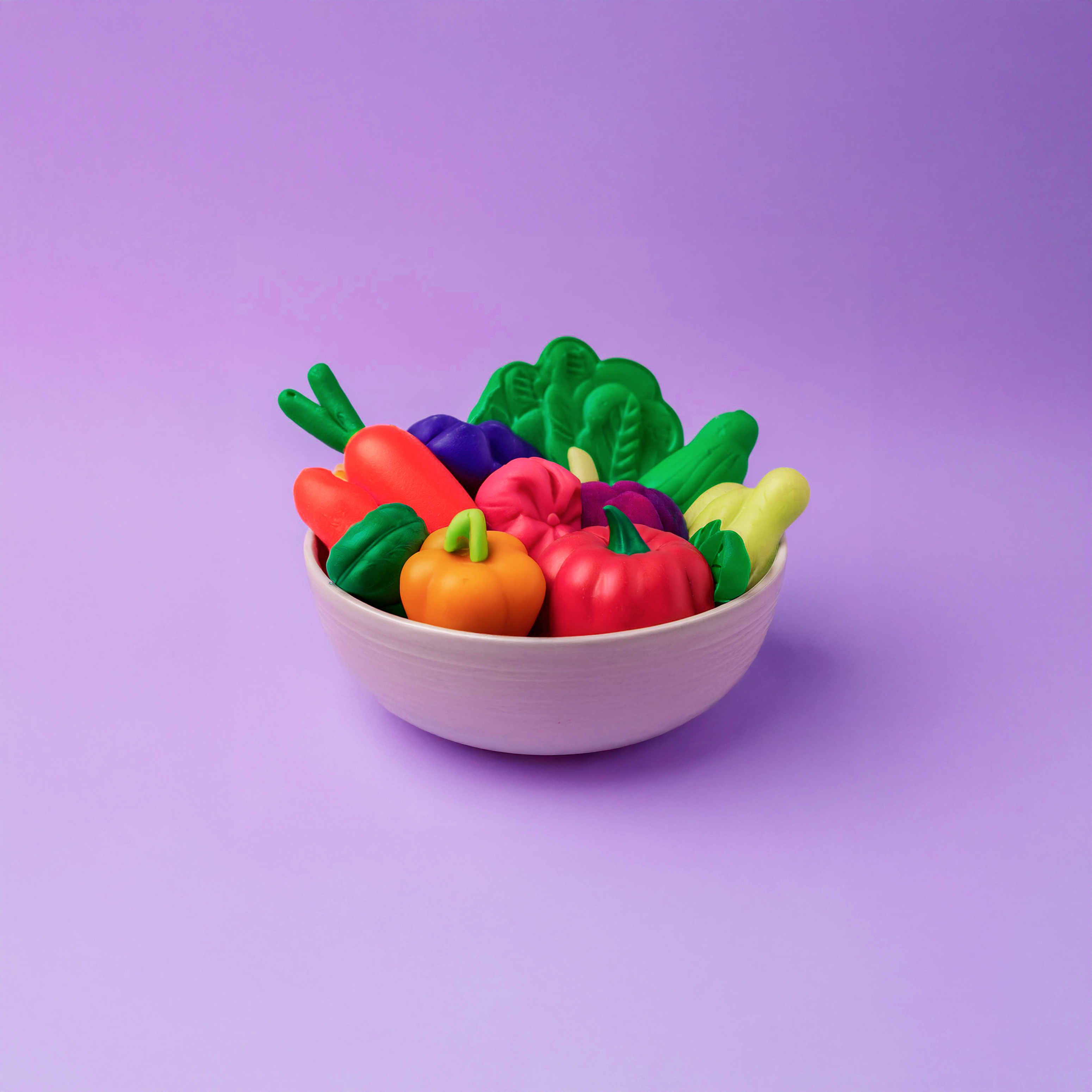
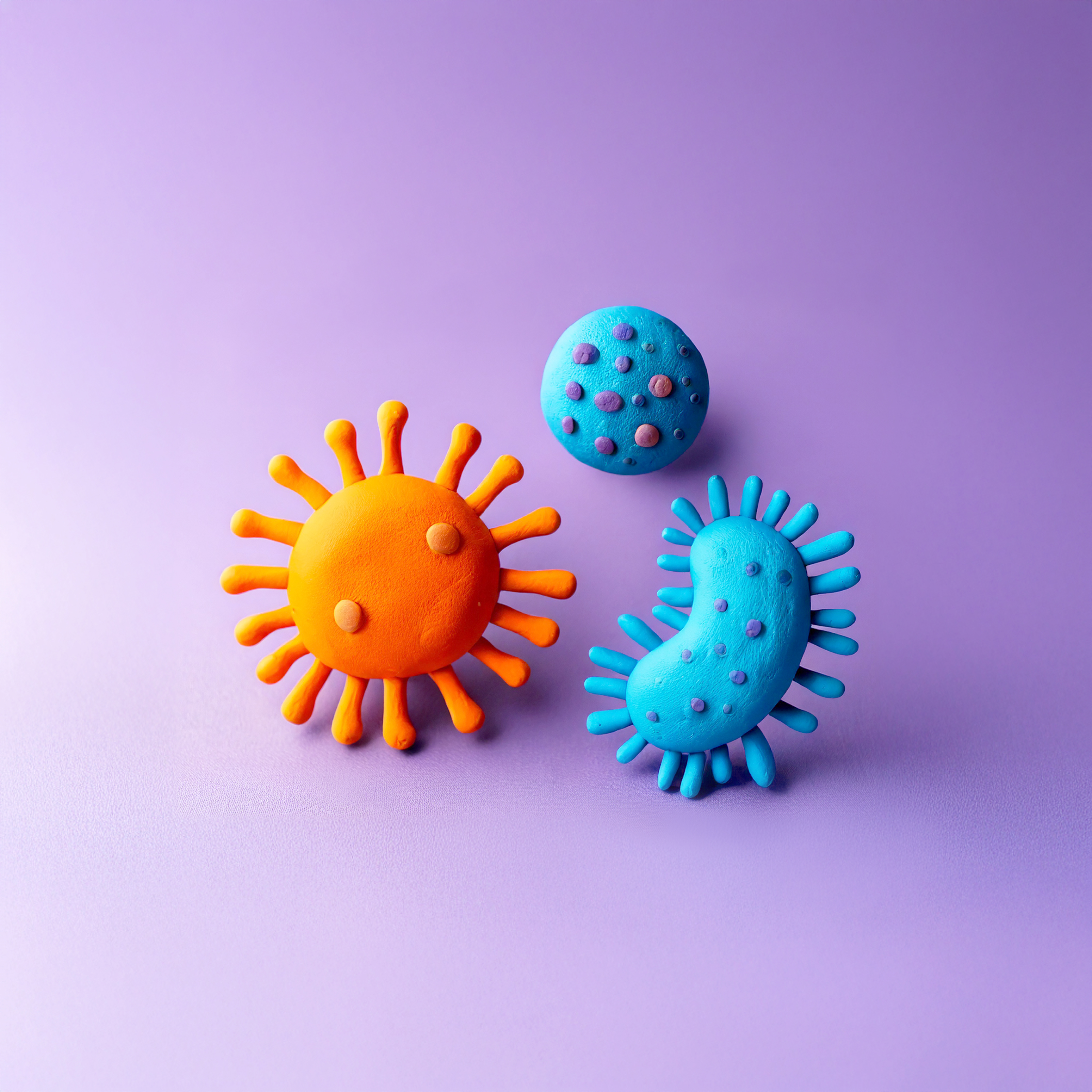
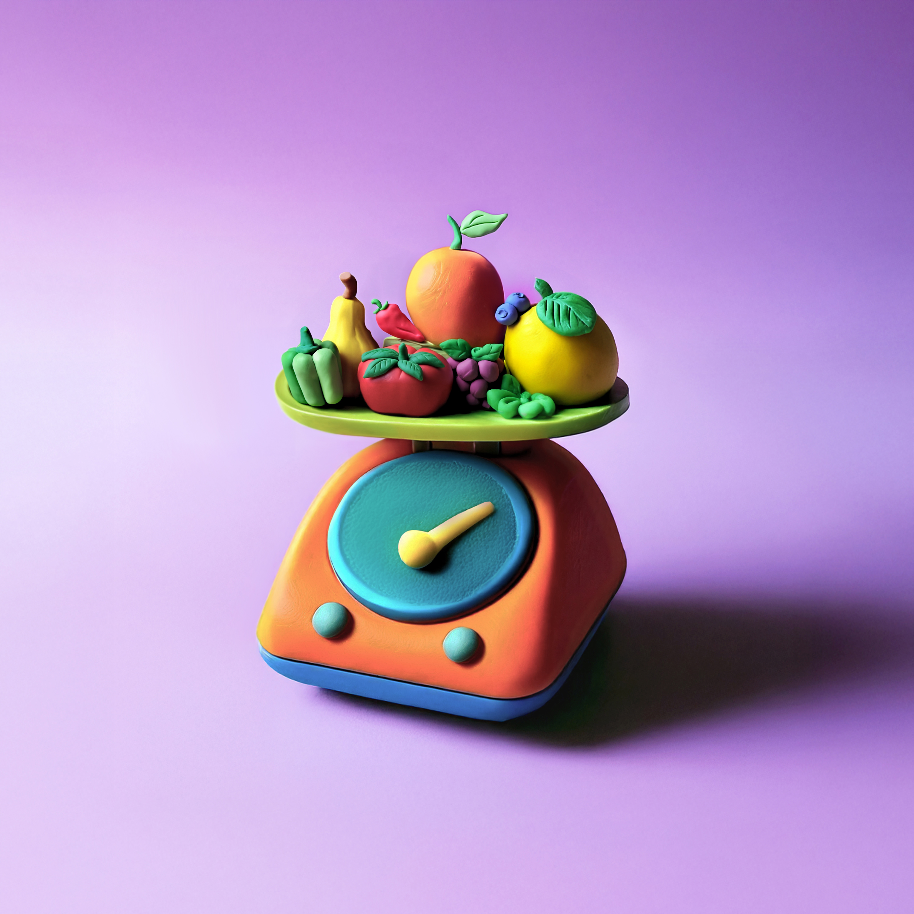
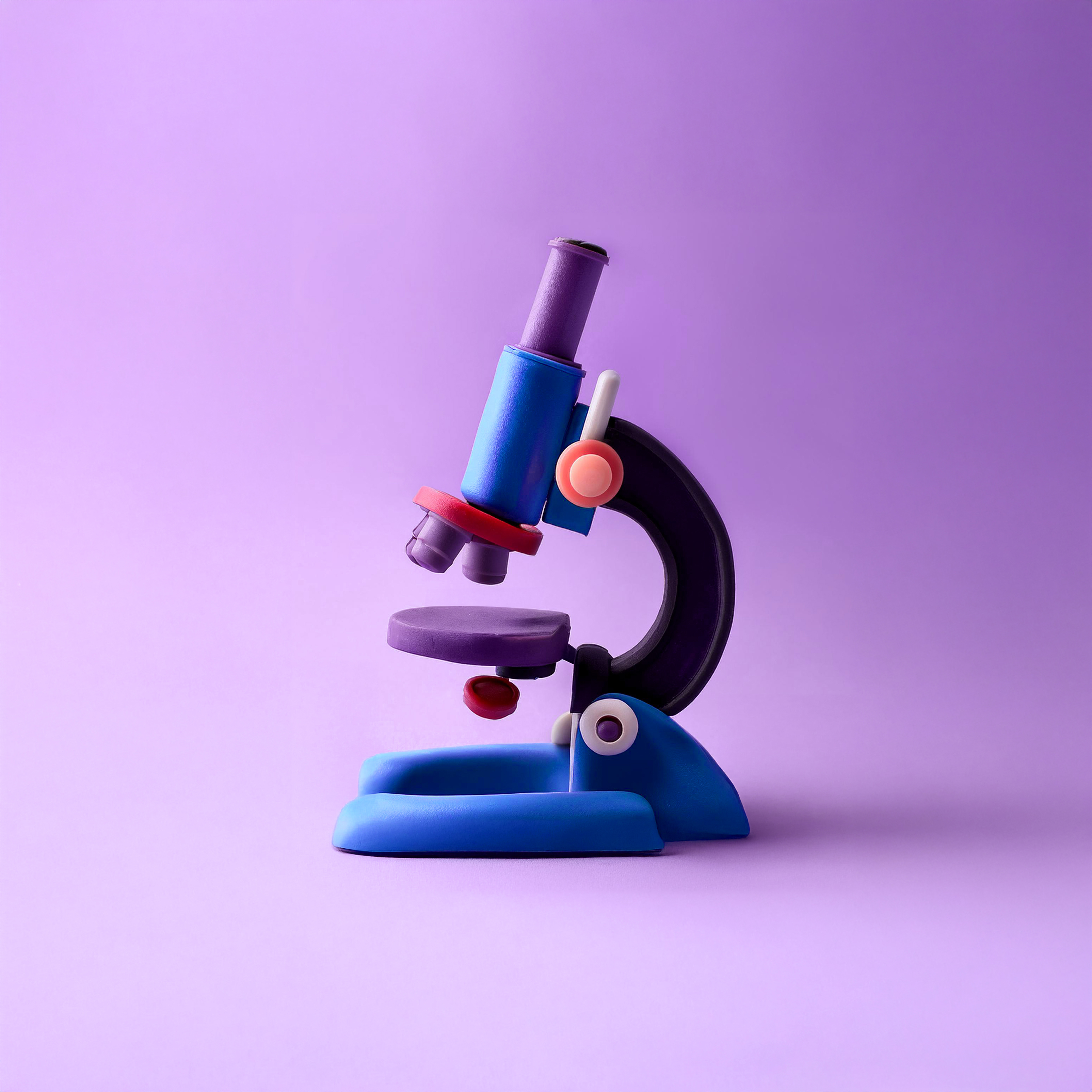
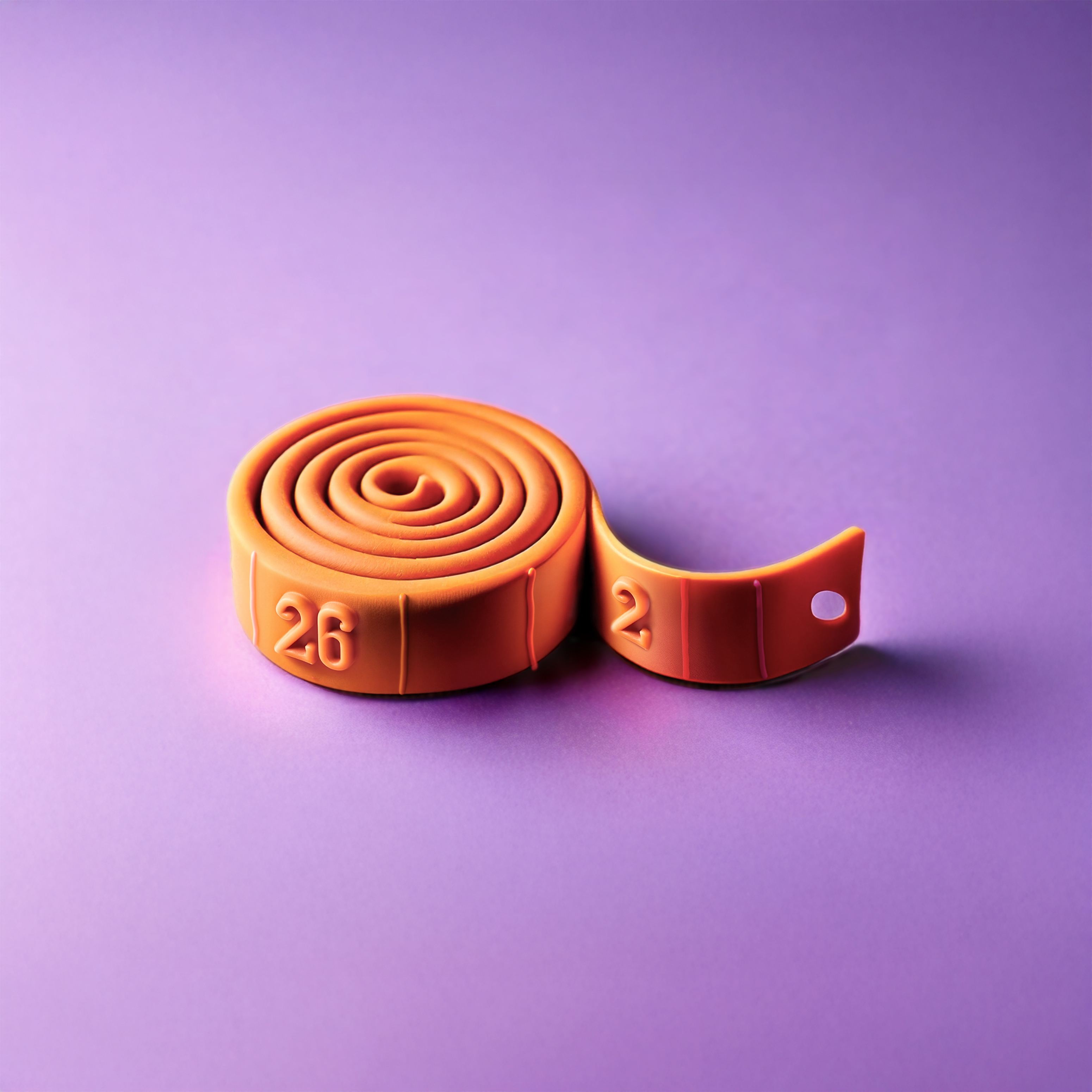
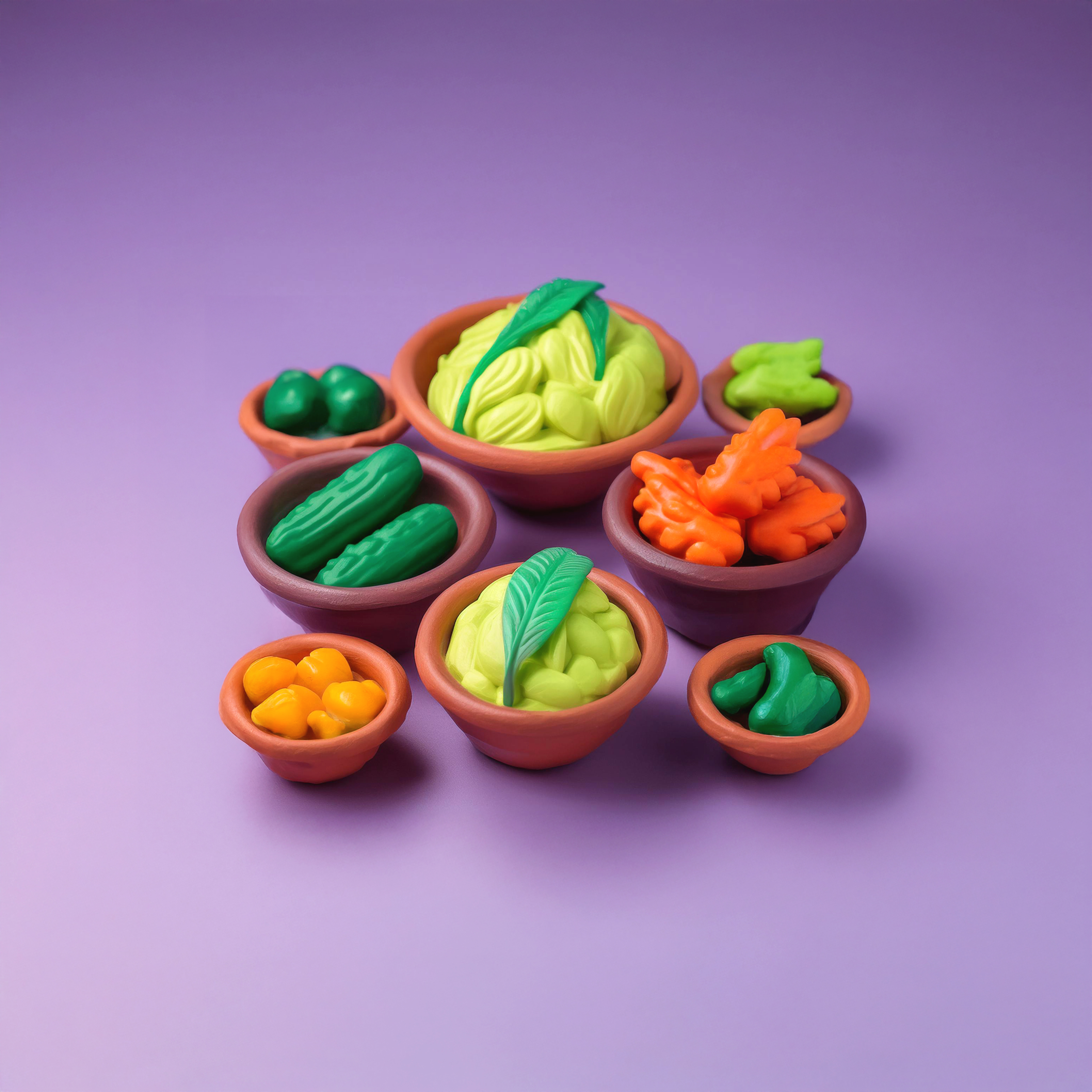
The image world took the same conviction and the creative direction pushed it even further. A single, unexpected material: clay. Organic, malleable, and warm - it mirrors the digestive system's own nature, and the possibility of reshaping it through research and care. Just as clay can be molded and reshaped, the digestive system can be nurtured through innovation and treatment - a quiet but powerful metaphor for everything MDL Fonds stands for. The material's handcrafted quality also does something the clinical world rarely manages: it makes vulnerability feel safe. Approachable. Human. Art directed with intention and brought to life with AI, the resulting images translate one of the most stigmatized topics in healthcare into something people can actually look at, connect with, and feel. Not in spite of the subject matter - because of it.

Human enough to feel. Loud enough to matter.
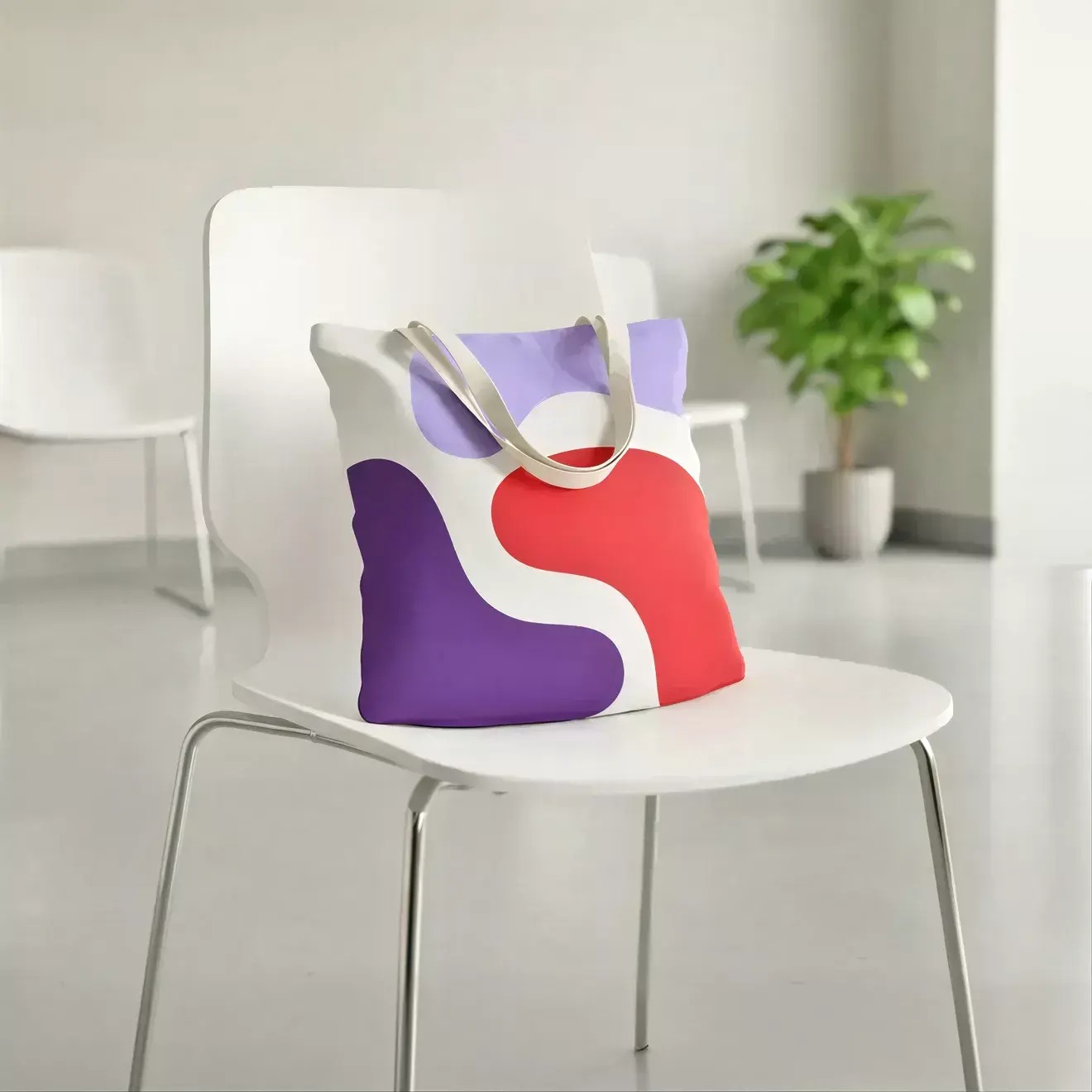
MDL Fonds clay artwork

Project collaborations: Michael Vromans (CCO), Davide Mancini (CD), Tamar Kutalia (intern designer), Laura Vecchio (junior designer), Kevin Nijland (motion designer), Braam de Villiers (UX designer)

Note: MDL Fonds collaborates closely with multiple external freelancers. Some productions were designed outside DPDK, however mostly under my Art Direction supervision/approval and contact - through all years of this partnership.
The future of AI compliance and model risk management, Yields, 2024

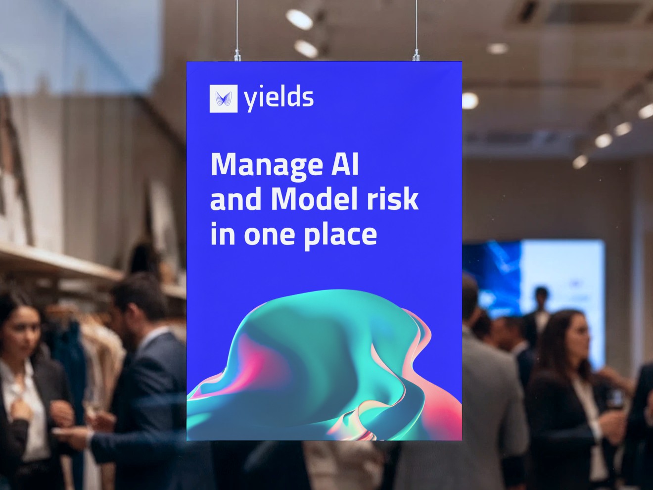
Yields brand on an event screen: Manage AI and Model risk in one place

The project scope

Rebrand, strategy, website. Role as Creative Director and Designer.
The scenario

Everyone is racing to put AI to work, but the truth is that models still “get things wrong” - quietly, and at a cost that only shows up much later - and compliance is now the price of running them at all. Yields is an award-winning SaaS platform that helps financial institutions and corporates stay in control of their models and AI systems. A platform that keeps both in check: traditional models and modern AI, centralised in one place, risk-scored, with responsibilities tracked and compliance provable at scale. Founded in Ghent in 2017, Yields had spent eight years quietly becoming one of the most awarded platforms in model risk. A tool for quants, turning into infrastructure for everyone. But the brand still spoke the language it was born in: technical, cautious, indistinguishable from every compliance vendor in the category. The product was already leading, however the brand was still asking permission - we, DPDK, were ready to change that.

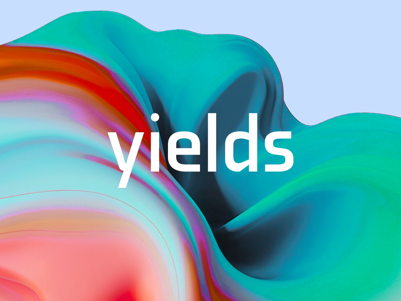
Yields wordmark over a fluid, data-driven gradient

The approach

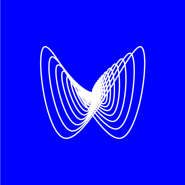
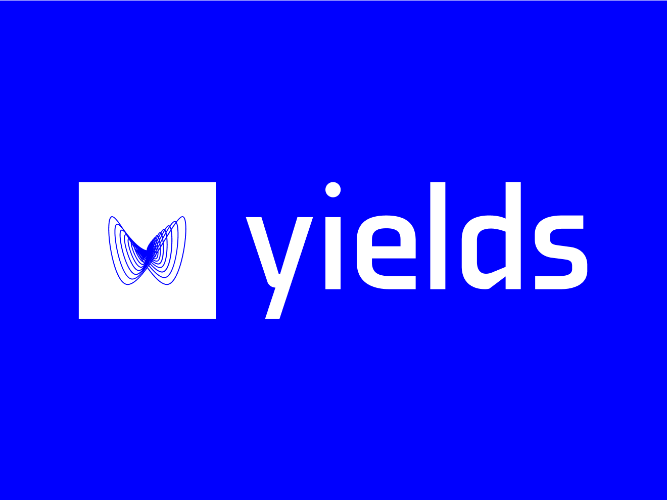
DPDK was brought in for the full brand - identity, patterns, website. The identity earns its distinctiveness from the mechanism it exists to stop, and was built around a single creative decision: containment. The logomark is a butterfly, drawn as one unbroken outline. The butterfly effect: a small unseen error, a rounding, a drift - and a consequence nobody sized, arriving much later and somewhere else. That is what an unwatched model does. The mark is held inside a box, and the box is the argument. It is the exact point where the chain reaction is stopped - the effect, blocked at its origin, before it can become anything. Every surface obeys it. The patterns are that same mark, generated again and again. Rotated, scaled, layered, multiplied, take the butterfly, rotate it, repeat it - and shapes appear that were never drawn. Nothing is added: one outline, one small change, and the system returns something nobody designed. A brand language that behaves exactly like the thing it governs, where a minor misreading produces a result you didn't predict.

Yields butterfly brandmark, drawn as one unbroken outline
Yields wordmark
Yields horizontal logomark — butterfly mark and wordmark
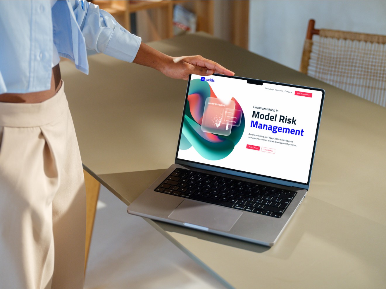
Yields website on a MacBook
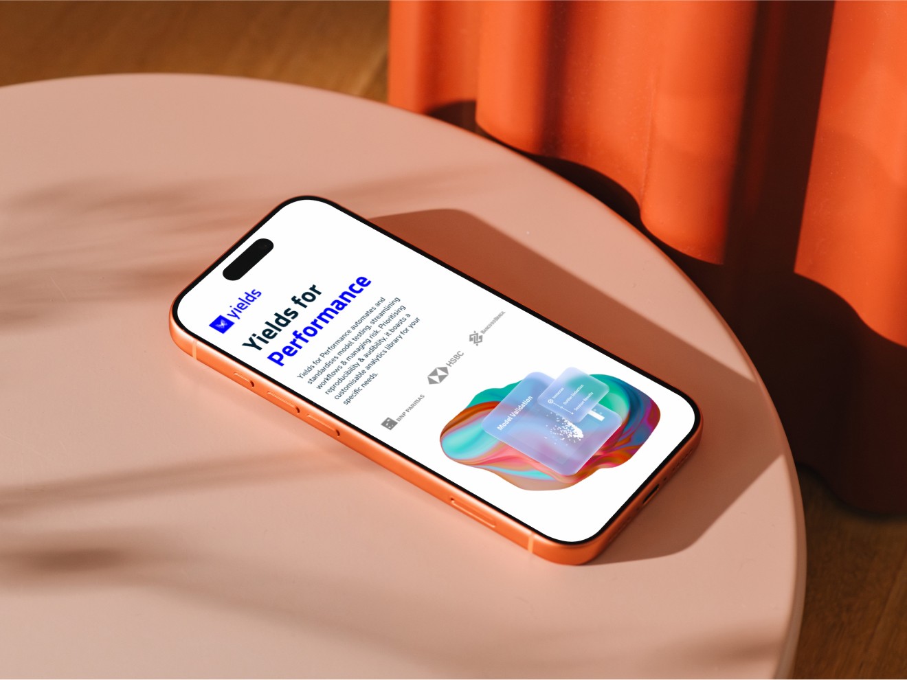
Yields app on an iPhone

Inspired by Refik Anadol, the uniqueness

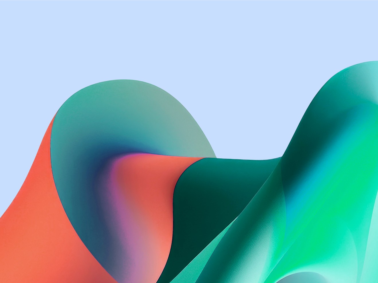
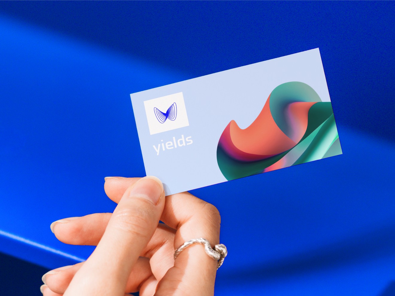
Yields' imagery had to be made of the material the company is built on. Not people at laptops, not dashboards, not abstraction: data. A single, unexpected reference: Refik Anadol. The artist who takes vast archives - 113 million images of New York, 200 million photographs of the Earth, a century of an orchestra's recordings - and feeds them to a machine until they come back as image matter. Fluid, volumetric, alive. His whole subject is the unseen world of data: making visible what the eye was never able to see. That is Yields' business: institutions are running on data they cannot see - thousands of models, millions of decisions, a landscape nobody has ever actually looked at. The blobs are not decoration but data, given a body: dense, volumetric, in flux, generated with AI and art directed through abstract as something you can see. Where Anadol tunes toward the sublime, we tuned toward the governed.

Data-blob imagery — dense, volumetric, generated with AI
Yields brand collateral held in hand

The impact

Yields stopped looking like compliance software and the brand finally matches the success of its product. Yields walks into a room full of banks and regulators no longer looking like one more compliance vendor, but like the company that defines the category it already leads. A brand that speaks in a language entirely its own - built from its own subject matter. The blobs carry the scale of what Yields governs, the interface stays plain where the proof lives, and the identity holds the two together instead of decorating either. It's a brand that doesn't talk about control - it's built out of it. Every surface, every pattern, every image - grown from data, and never out of hand.

Yields data-blob imagery
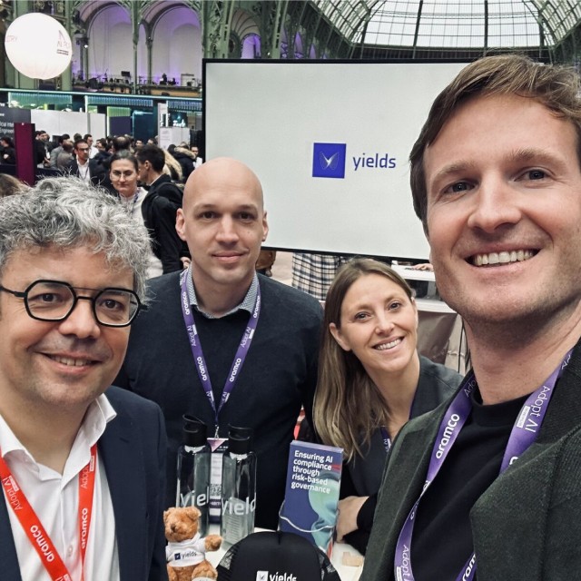
The Yields and DPDK team at an event